| Author | Thread |
|
|
07/15/2005 03:08:48 PM |
|
Comments Made During the Challenge  |
|
|
04/03/2005 12:26:57 PM |
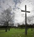
| Good shot with lovely sky. Bumping up. |
|
 Photographer found comment helpful. Photographer found comment helpful. |
|
|
04/03/2005 11:00:32 AM |
| I very much like the way you handled the tonaltiies in this, although a bit more shadow detail in the trees might(?) have helped. |
|
| Photographer found comment helpful. |
|
|
04/03/2005 03:14:23 AM |
| Very moving image, nice capture! |
|
| Photographer found comment helpful. |
|
|
04/01/2005 09:06:52 AM |
| Nice, good cemetary feel. Could perhaps ave been a bit more contrasty? |
|
| Photographer found comment helpful. |
|
|
03/31/2005 08:43:00 PM |
| I think this would have looked better if you had cropped off the column at the left hand edge |
|
| Photographer found comment helpful. |
|
|
03/30/2005 09:56:07 PM |
| I like the little bit of a fisheye feel. |
|
| Photographer found comment helpful. |
|
|
03/30/2005 03:32:16 PM |
| i really like this one, is like a shot from a oscar winning movie |
|
| Photographer found comment helpful. |
|
|
03/30/2005 09:25:47 AM |
| I really like te way this one turned out. NIce light |
|
| Photographer found comment helpful. |
|
|
03/29/2005 03:33:56 PM |
| Awesome Photo! One of my top picks... I am not sure the column and building on the left is doing justice for me ... |
|
| Photographer found comment helpful. |
|
|
03/29/2005 07:41:53 AM |
I am making two passes on this Challenge. I will vote on your photo then return later(before voting is over) to comment on what I like and dislike about your shot. You can take the comments however you wish and I will try not to be mean. Just don't take it the wrong way.
--------------------------------------------------------------------------------------------------------------
Nice. I normally would like to see a little color. You haver made the tones so perfect that it all works. Bumping up. |
|
| Photographer found comment helpful. |
|
|
03/29/2005 03:12:41 AM |
|
| Photographer found comment helpful. |
|
|
03/28/2005 11:25:41 PM |
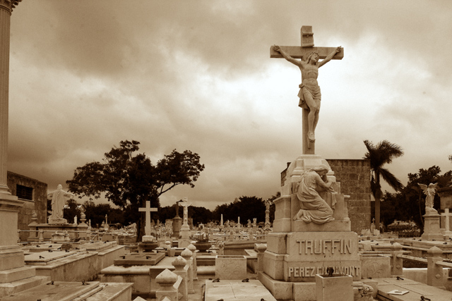
| I like that the brightest part of the sky is behind the crucifix...i'm trying to decide if I would have cropped out the column on the left or not....nice tonality, although my personal preference would be for the blacks to be just a tiny bit blacker. 7 |
|
| Photographer found comment helpful. |
|
|
03/28/2005 10:45:33 PM |
| I think "No Vacancy" would have been a good title for this one... I like the color tone but my eyes really don't know where to focus. |
|
| Photographer found comment helpful. |
|
|
03/28/2005 04:16:44 PM |
| personally I can't stand sepia except in rare situations, I do like the composition though |
|
| Photographer found comment helpful. |
|
|
03/28/2005 12:21:57 PM |
| I really like your composition and tone. I only wish the foreground and cross were more in focus or sharper. I am not sure if it's just the resolution or how the picture actually is. |
|
| Photographer found comment helpful. |
|
|
03/28/2005 08:39:55 AM |
| pillar on left distracting - overall image very nice |
|
| Photographer found comment helpful. |
|
|
03/28/2005 08:24:41 AM |
| Wow, great shot and perfect placing of the sun behind the crucifix |
|
| Photographer found comment helpful. |
|
|
03/28/2005 01:17:57 AM |
| oh, if only that column on the left was cropped out. better cropping would have this score MUCH higher, i give it a 6. |
|
| Photographer found comment helpful. |
|
|
03/28/2005 12:17:05 AM |
| Wonderful timing with the clouds behind your subject, otherwise it appears to be a little dark elsewhere in the photo. Maybe just a tad bit more contrast? |
|
| Photographer found comment helpful. |
Home -
Challenges -
Community -
League -
Photos -
Cameras -
Lenses -
Learn -
Help -
Terms of Use -
Privacy -
Top ^
DPChallenge, and website content and design, Copyright © 2001-2025 Challenging Technologies, LLC.
All digital photo copyrights belong to the photographers and may not be used without permission.
Current Server Time: 03/12/2025 04:11:22 AM EDT.