| Author | Thread |
|
|
08/30/2003 06:57:49 PM |
|
|
|
04/06/2003 11:13:31 PM |
Greetings from the Critique Club
By Inspzil
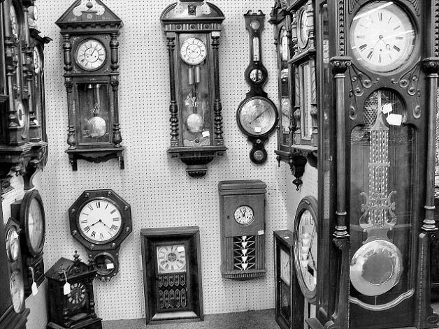
Composition - The first major photographic faux pas here I see is that the photo is not level with the horizon. This is especially troubling to photos where there is some substantial reference to what the horizon is, namely the pegboard in the back. The other thing I think is that too much was included in this pic. I'd have chosen one good corner and really focused on 6 or 7 clocks there where you could have a little control over their reflections in their faces. There is much potential here for good shots. There is a lot of potential for this shot to be good. Great subject(s) for this challenge. The only part I don't like in terms of what's in the picture is the grandfather clock on the right side with the bad reflections of the fluorescent lights in the face.
Technical - As far as photographic skill, its pretty well taken. The focus is off slightly. I think the angle could've been better and just choosing what to shoot could've been better. It isn't bad like this though. I like the exposure and DOF. It looks great in black and white too.
Overall - The score is probably lower than I would expect. Some folks are really picky about true to the horizon (I am too). I think in this case it would've made a pretty substantial difference in your score. Maybe 5.3-5.5 area in lieu of 4.8ish. A little better focused and it would've made just that much more of a difference. All in all I think you had the right idea, just maybe needed a bit more time to hone the shot or a little help in properly editing it so it wasn't so off kilter. Not bad though. Good luck in future challenges - Inspzil |
|
Comments Made During the Challenge  |
|
|
03/30/2003 09:50:24 PM |
|
|
|
03/30/2003 01:02:53 PM |
| Very nice. Contrasts here lends itself to B/W well. |
|
|
|
03/29/2003 11:30:59 AM |
|
|
|
03/27/2003 09:00:25 PM |
| This is such a great idea, and you manage to show many different kinds of clocks. I find the light and tone levels a bit uninteresting, and the clocks seem out of focus, but I love the way you subtly contrast the many styles of clocks in your frame. |
|
|
|
03/27/2003 05:32:36 AM |
| B&W does nothing here, and everything is laning to the left |
|
|
|
03/26/2003 02:34:30 PM |
|
|
|
03/26/2003 01:47:39 PM |
| i like the effect you used for this picture nice work |
|
|
|
03/26/2003 09:17:19 AM |
| Unity of the frame is comment i have here. Maybe there should be one clock as subject the others as pattern. I hope my comment makes sense |
|
|
|
03/25/2003 01:31:35 PM |
|
 Photographer found comment helpful. Photographer found comment helpful. |
|
|
03/24/2003 09:00:18 PM |
| Photo is a bit crooked - that's unsettling. Like the photo otherwise - neat clocks and I like the B&W |
|
| Photographer found comment helpful. |
|
|
03/24/2003 08:17:26 PM |
| I enjoy this as a B/W. It relays the sense of character of an era long past. Great. |
|
|
|
03/24/2003 07:59:39 PM |
| Feels like it is chopped off at the top. |
|
Home -
Challenges -
Community -
League -
Photos -
Cameras -
Lenses -
Learn -
Help -
Terms of Use -
Privacy -
Top ^
DPChallenge, and website content and design, Copyright © 2001-2025 Challenging Technologies, LLC.
All digital photo copyrights belong to the photographers and may not be used without permission.
Current Server Time: 03/12/2025 01:58:33 AM EDT.