| Author | Thread |
|
|
04/04/2005 01:31:16 PM |
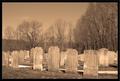
I think that loosing some of that sky to include more of the foreground would work a lot better here. Now you have that huge sky part sucking attention away from your actual subject: the cemetery. The sky in a way takes the intimacy of the cemetery away and besides that, it seldomly works to put the horizon in the middle of the frame like that.
Including more of the foreground would look like you are more interested in the cemetery. |
|
Comments Made During the Challenge  |
|
|
03/30/2005 05:44:39 PM |
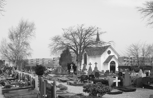
| it really could improve this image with some more contrast and without the bushy trees in the edges..nevertheless a very nice view..7 |
|
 Photographer found comment helpful. Photographer found comment helpful. |
|
|
03/29/2005 11:05:17 AM |
I am making two passes on this Challenge. I will vote on your photo then return later(before voting is over) to comment on what I like and dislike about your shot. You can take the comments however you wish and I will try not to be mean. Just don't take it the wrong way.
--------------------------------------------------------------------------------------------------------------
Seems too busy. I see apartments in the background. I think this would benefit with a closer shot. |
|
| Photographer found comment helpful. |
|
|
03/28/2005 04:12:05 AM |
|
| Photographer found comment helpful. |
|
|
03/28/2005 01:35:12 AM |
| nice composition. I like the dull dreary mood here, but the soft focus doesnt go well here. not as sharp as could be and the focus could be a tad better. Perhaps tough weather conditions and a dull sky prevent this one from reallly grabbing attention. 5 |
|
| Photographer found comment helpful. |
Home -
Challenges -
Community -
League -
Photos -
Cameras -
Lenses -
Learn -
Help -
Terms of Use -
Privacy -
Top ^
DPChallenge, and website content and design, Copyright © 2001-2025 Challenging Technologies, LLC.
All digital photo copyrights belong to the photographers and may not be used without permission.
Current Server Time: 03/16/2025 05:11:58 AM EDT.