| Author | Thread |
Comments Made During the Challenge  |
|
|
04/03/2005 08:59:40 PM |
| Nice repetition of themes in this photo. I like the vertical layout. |
|
 Photographer found comment helpful. Photographer found comment helpful. |
|
|
04/03/2005 06:53:38 PM |
| nice title, good picture, composition could have been a little better. |
|
| Photographer found comment helpful. |
|
|
04/03/2005 01:00:26 PM |
| Great title, bumping up for that :) |
|
| Photographer found comment helpful. |
|
|
04/01/2005 03:38:38 PM |
|
| Photographer found comment helpful. |
|
|
03/31/2005 01:17:04 PM |
| I'm fond of the title and contrasting textures |
|
| Photographer found comment helpful. |
|
|
03/30/2005 03:45:37 AM |
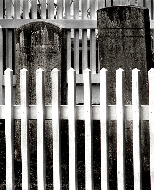
| A completely different image in a challenge filled with sameness. I like it very much and hope it does well, though I suspect it won't. The white slats in front may be a little TOO bright, but not by a lot. |
|
| Photographer found comment helpful. |
|
|
03/29/2005 11:24:40 AM |
I am making two passes on this Challenge. I will vote on your photo then return later(before voting is over) to comment on what I like and dislike about your shot. You can take the comments however you wish and I will try not to be mean. Just don't take it the wrong way.
--------------------------------------------------------------------------------------------------------------
I don't like the fence. I know it goes along with your title. It is just too distracting. |
|
| Photographer found comment helpful. |
Home -
Challenges -
Community -
League -
Photos -
Cameras -
Lenses -
Learn -
Help -
Terms of Use -
Privacy -
Top ^
DPChallenge, and website content and design, Copyright © 2001-2025 Challenging Technologies, LLC.
All digital photo copyrights belong to the photographers and may not be used without permission.
Current Server Time: 03/16/2025 07:52:34 AM EDT.