| Author | Thread |
|
|
09/06/2005 09:45:13 AM |
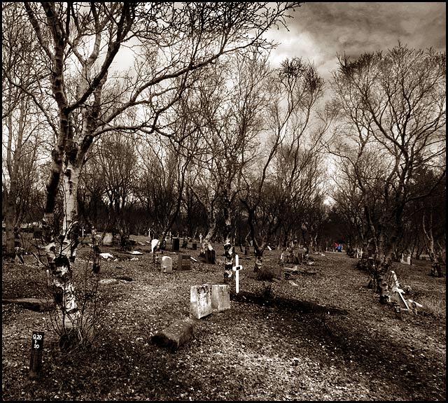
| I love graveyard shots. This is excellent. The mood with the filter you used, is one of days gone by. I love the trees being such a prominent feature as well. Really well composed. |
|
|
|
09/06/2005 08:52:18 AM |
| nice dark room work . use of colour in the center palce of attraction catches eye |
|
Comments Made During the Challenge  |
|
|
04/03/2005 04:29:39 PM |
| I like the tone of this photo. |
|
|
|
04/02/2005 10:45:18 AM |
| This is my second go-around =) -Looks good, but I have trouble knowing what to focus on when I look at your photo... it looks really busy. However, I do like your idea and take on the challenge. Overall I think you did a good job =) |
|
|
|
04/01/2005 06:41:46 AM |
| Horizon bent out of shape.. A bit uninspiring (maybe I just don't get the joke). |
|
|
|
03/30/2005 08:43:09 PM |
I am making two passes on this Challenge. I will vote on your photo then return later(before voting is over) to comment on what I like and dislike about your shot. You can take the comments however you wish and I will try not to be mean. Just don't take it the wrong way.
--------------------------------------------------------------------------------------------------------------
Nice tones. The border adds nothing though. |
|
|
|
03/30/2005 04:39:21 PM |
| Interesting photo but the people are SO far in the distance that it makes their search sort of moot. |
|
|
|
03/30/2005 08:27:48 AM |
| Now here's a nice idea! Unfortunately the figures aren't really big enough for the full effect. I've just spotted the little plank down the bottom left - is that what they're looking for? Perhaps more focus on that then too - but aside ti's a very good photo and a nice idea. Here endeth the lesson. |
|
|
|
03/29/2005 08:21:33 PM |
| A little bit busy, though the implied lines lead you to the people far away. Very interesting work, |
|
|
|
03/29/2005 09:22:29 AM |
|
|
|
03/28/2005 08:24:25 PM |
| the contrast is a bit harsh |
|
|
|
03/28/2005 01:37:55 PM |
| Bleak and effective-what is that in colour far away..I kind of like it and at the same time find it a bit annoying as I am not sure of what I am looking at-overall well done. |
|
|
|
03/28/2005 12:26:16 PM |
Good image.
I don't personally like the people being highlighted in that way.
Good tones. |
|
|
|
03/28/2005 09:39:39 AM |
| We simply never would have gotten the title had the subjects been unsaturated like with the rest of the photo. I like the fact that they are tiny; but I'm unconvinced that they really add photographic interest to the photo. I love the trees and the implied lines in the photo. |
|
|
|
03/28/2005 06:46:18 AM |
| The two colour figures make for an interestng focal point and give the snse of searching through the vast graveyard for the grave in question. Personally I think you could have achieved the same "message" by getting in a bit closer and making more of the figures. Nice message though. |
|
|
|
03/28/2005 12:22:28 AM |
| the ones in color are way too far away... almost missed them |
|
Home -
Challenges -
Community -
League -
Photos -
Cameras -
Lenses -
Learn -
Help -
Terms of Use -
Privacy -
Top ^
DPChallenge, and website content and design, Copyright © 2001-2025 Challenging Technologies, LLC.
All digital photo copyrights belong to the photographers and may not be used without permission.
Current Server Time: 03/12/2025 09:35:09 PM EDT.