| Author | Thread |
|
|
04/07/2005 09:57:08 PM |
| I thought this worthy of much higher scores, at least top 5! Very nice shot. The warm tones throughout are very appealing and a nice break from cold dark cemetery shots. |
|
 Photographer found comment helpful. Photographer found comment helpful. |
|
|
04/04/2005 11:31:21 AM |
| oooh...really great shot, jen! the muted colors makes for a great mood. great work! |
|
| Photographer found comment helpful. |
Comments Made During the Challenge  |
|
|
04/01/2005 09:59:54 PM |
| I like the fade to black on the borders of the image...nice shot. |
|
| Photographer found comment helpful. |
|
|
03/31/2005 10:49:17 AM |
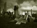
| Trinity Church...great angle from a hard to shoot location through that damn fence! Don't know how many would appreciate this historic site...I do. Great job! |
|
| Photographer found comment helpful. |
|
|
03/30/2005 07:09:16 PM |
| This is my second go-around =) I love the location you chose! For some reason, I just think that the foreground (very bottome of the picture) looks very blurry- it's a little distracting. Also, I think you may have burned the corners a little too much... it's a great idea to do for your composition, however, next time I would not burn as much. Otherwise, I really like you photo! Great job! |
|
| Photographer found comment helpful. |
|
|
03/29/2005 11:14:51 PM |
| lovely tones in this shot. I find the out of focus stone in the foreground a little distracting for some reason. Very effective burning at the top edge |
|
| Photographer found comment helpful. |
|
|
03/29/2005 09:48:01 PM |
| Great POV. The vignetting effect creates an interesting mood. |
|
| Photographer found comment helpful. |
|
|
03/29/2005 07:00:38 PM |
| I feel this needs to be leveled (about 0.6 ccw). I don't care for the darkening edges, especially at the bottom. The central statue draws the eye anyway so it is unnecessary. The colour and light is good. I do like the photo, but think it could be better and this is just my opinion after all. |
|
| Photographer found comment helpful. |
|
|
03/29/2005 05:05:10 PM |
| Great lighting--fair compisition |
|
| Photographer found comment helpful. |
|
|
03/29/2005 03:55:37 PM |
| Awesome photo! I like the way you used vignetting! |
|
| Photographer found comment helpful. |
|
|
03/29/2005 11:17:14 AM |
I am making two passes on this Challenge. I will vote on your photo then return later(before voting is over) to comment on what I like and dislike about your shot. You can take the comments however you wish and I will try not to be mean. Just don't take it the wrong way.
--------------------------------------------------------------------------------------------------------------
I don't like how the edges are dark and blurry. I think this is something you meant to do so I won't count off for that. The tree is a little distracting on the left. |
|
| Photographer found comment helpful. |
|
|
03/28/2005 01:28:27 AM |
| Vignetting adds interest here. Nicely composed, focused, leveled. Good job! What the heck does insomnolence mean? |
|
| Photographer found comment helpful. |
Home -
Challenges -
Community -
League -
Photos -
Cameras -
Lenses -
Learn -
Help -
Terms of Use -
Privacy -
Top ^
DPChallenge, and website content and design, Copyright © 2001-2025 Challenging Technologies, LLC.
All digital photo copyrights belong to the photographers and may not be used without permission.
Current Server Time: 03/17/2025 01:28:17 AM EDT.