| Author | Thread |
Comments Made During the Challenge  |
|
|
04/05/2005 03:45:20 PM |
|
|
|
04/05/2005 01:30:21 AM |
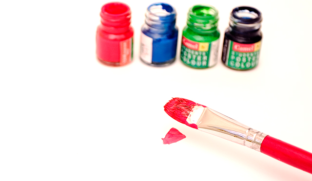
| I see too much white space, the image seems a bit off-balance. The idea is good, but I would have liked to see something different. |
|
|
|
04/04/2005 10:48:33 PM |
| Thanks for taking something other than the biblical view of the challenge. A nice composition, simple, and directly to the point. Don't change a thing. |
|
|
|
04/04/2005 05:52:07 PM |
| The brush seems a little soft in terms of focus. I like the DOF though. |
|
|
|
04/04/2005 02:17:03 PM |
| Beginning of a work of art. I like the concept. I think the bottle are a bit too out of focus. Maybe a more flowing stroke of paint on the canvas would have been nice as well. |
|
|
|
04/04/2005 02:55:53 AM |
|
|
|
04/03/2005 11:58:04 PM |
| This idea has potential, but the execution is poor. The paint should be in focus and it should be clearer that this is the beginning of a craft or other work of art. |
|
|
|
04/01/2005 10:19:42 PM |
| Interesting use of simple materials! |
|
|
|
04/01/2005 08:59:37 PM |
| I dont think an artist will have the paints on top of their work. |
|
|
|
03/31/2005 09:35:02 AM |
| wioth some yellow you would have had a primary colours stock photo... nice idea, well composed (I like the negative space). Maybe slightly over exposed and the red is not as intense as it seems that it should be (maybe something you could play with in PS under hues and saturation). Looks like you might have increased the saturation until some detail lost, when altering the hue very slightly would have given a better result. |
|
|
|
03/31/2005 05:56:55 AM |
| I think a greater DOF to get the bottles in sharper focus as well would improve it. Just my opinion. Nice use of colours nevertheless. |
|
|
|
03/30/2005 11:23:44 AM |
| One of the few tastefull images on this challenge! great job! 8 |
|
|
|
03/30/2005 01:38:17 AM |
| Needs more DOF Nice comp! |
|
Home -
Challenges -
Community -
League -
Photos -
Cameras -
Lenses -
Learn -
Help -
Terms of Use -
Privacy -
Top ^
DPChallenge, and website content and design, Copyright © 2001-2025 Challenging Technologies, LLC.
All digital photo copyrights belong to the photographers and may not be used without permission.
Current Server Time: 03/12/2025 02:46:04 AM EDT.