| Author | Thread |
Comments Made During the Challenge  |
|
|
04/10/2005 08:41:02 PM |
|
|
|
04/10/2005 12:38:03 PM |
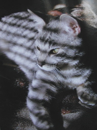
| looks like a cute pictue, but it is so small, makes it hard to see any detail. |
|
|
|
04/09/2005 10:57:05 PM |
| This image is too small to rate appropriately hence the 3 |
|
|
|
04/09/2005 02:54:49 PM |
|
|
|
04/09/2005 12:50:19 AM |
| I think you should try to make your image as large as the rules allow. This would have been interesting in black and white. |
|
|
|
04/08/2005 07:45:55 PM |
|
|
|
04/08/2005 12:07:17 PM |
| Larger print would have been helpful. The concept is good, but the striped shadows distract from a beautiful animal IMO. |
|
|
|
04/08/2005 11:58:23 AM |
| too small to enjoy the photo |
|
|
|
04/08/2005 09:06:20 AM |
| I know for a fact you have heard about the size a million times already and we already talked about that, will try to find some on line tutorials that will help with that. Otherwise this is a great shot! I love the expression on the cat's face, the lines going both ways, one doesn't overpower the other and yes, the foot getting cut off is a bit distracting but also lends to taking you in or out of the picture as a line of reference. Also, I can see the horse on the rug in the background, LOL :) I give you a 5 to start but am bumping to a 6 because the shot is good, just a bit small :O |
|
|
|
04/07/2005 11:43:30 PM |
| This is just too small to judge properly. |
|
|
|
04/05/2005 02:10:24 PM |
| I like this idea, but the photo is too small to see detail..could you have made it larger? It's a neat shot. |
|
 Photographer found comment helpful. Photographer found comment helpful. |
|
|
04/05/2005 11:38:42 AM |
| This photo is really too small to judge properly. Maybe you should check out the tutorial for saving the best size/quality for the 150KB limit. |
|
| Photographer found comment helpful. |
|
|
04/05/2005 10:39:19 AM |
| This is my second go-around =) - I really wish the photo was larger... if are unsure how to do this for the contests you can PM me afterwards. I really love your idea! I would like to see some highlights on kitty. Otherwise, great composition and idea! |
|
| Photographer found comment helpful. |
|
|
04/04/2005 09:56:45 PM |
| Great shot!! You'll probably get slammed for it being too small but I'm voting on the picture.. not the size!! |
|
| Photographer found comment helpful. |
|
|
04/04/2005 10:42:13 AM |
| You really should submit a larger image. It will really help your score. |
|
| Photographer found comment helpful. |
|
|
04/04/2005 08:00:28 AM |
| a bit small - will likley get marked down for that. Which is too bad, becase it looks like a very creative use of light. |
|
| Photographer found comment helpful. |
|
|
04/04/2005 06:26:50 AM |
| Too small, probably heard this a hundred times, the idea is really good though...one paw is not showing as well a little minus for that.... |
|
| Photographer found comment helpful. |
|
|
04/04/2005 01:38:35 AM |
| Sorry, I mark down photos that aren't submitted at the allowable size because shots this small don't allow full appreciation of the image. 3 |
|
| Photographer found comment helpful. |
|
|
04/04/2005 12:58:59 AM |
| I'll join in with all the others: too small, you need to make use of the allowed 640 pixels on the long side. The background is a bit too busy for a portrait, too. |
|
| Photographer found comment helpful. |
Home -
Challenges -
Community -
League -
Photos -
Cameras -
Lenses -
Learn -
Help -
Terms of Use -
Privacy -
Top ^
DPChallenge, and website content and design, Copyright © 2001-2025 Challenging Technologies, LLC.
All digital photo copyrights belong to the photographers and may not be used without permission.
Current Server Time: 03/12/2025 08:06:11 AM EDT.