| Author | Thread |
Comments Made During the Challenge  |
|
|
04/24/2005 10:23:49 PM |
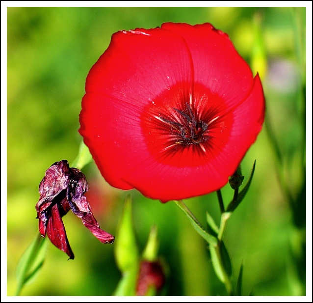
| too bright in color..nice composition though 5 |
|
 Photographer found comment helpful. Photographer found comment helpful. |
|
|
04/24/2005 10:15:01 PM |
| The red and the green have too strong a contrast, and the flower loses detail in the light |
|
| Photographer found comment helpful. |
|
|
04/24/2005 09:31:44 PM |
| way too over saturated for my tastes |
|
| Photographer found comment helpful. |
|
|
04/24/2005 02:23:42 PM |
digtal cameras are notorious for blowing out red highlights
this is a good example of such a blowout |
|
| Photographer found comment helpful. |
|
|
04/24/2005 02:08:09 AM |
| great color but a little too much sharpness |
|
| Photographer found comment helpful. |
|
|
04/22/2005 08:46:10 PM |
There is something about magenta tinged reds that makes them almost impossible to reproduce both accurately and attractively either digitallly or on film.
The framing is done well. and I like the interior details of the live flower.
I'm afraid that I find the background chartreuse and the foreground magenta to clash mightily. And there edge between the two colors seems a little funky. While I understand the reason to include a live flower and a dead one, and I applaud your effort, I'm finding the visual effect to be a little gratuitously ugly. |
|
| Photographer found comment helpful. |
|
|
04/21/2005 09:56:31 PM |
|
| Photographer found comment helpful. |
|
|
04/21/2005 07:50:51 PM |
| interesting photo. love the background and the wilted flower. but the centrasl flower has lost a lot of texture in processing |
|
| Photographer found comment helpful. |
|
|
04/20/2005 11:28:15 AM |
| Too much contrast if you ask me... Anyway, good image but hardly breathtaking either, gave it a 6. |
|
| Photographer found comment helpful. |
|
|
04/19/2005 05:27:15 PM |
you probably know but the red is a little blown out.
|
|
| Photographer found comment helpful. |
|
|
04/19/2005 01:08:47 PM |
im not a fan of macro flowers shot but i admit this has something extra
nice one |
|
| Photographer found comment helpful. |
|
|
04/19/2005 12:39:56 PM |
| Very stark colors. There is a nice contrast between th red and green happening here. |
|
| Photographer found comment helpful. |
|
|
04/19/2005 12:08:49 PM |
| The red on the live flower seems a bit oversaturated to me, making the color seem unatural. |
|
| Photographer found comment helpful. |
Home -
Challenges -
Community -
League -
Photos -
Cameras -
Lenses -
Learn -
Help -
Terms of Use -
Privacy -
Top ^
DPChallenge, and website content and design, Copyright © 2001-2025 Challenging Technologies, LLC.
All digital photo copyrights belong to the photographers and may not be used without permission.
Current Server Time: 03/16/2025 07:47:48 AM EDT.