| Author | Thread |
Comments Made During the Challenge  |
|
|
04/19/2005 06:38:10 PM |
| I like the Subject, Wisf the people are the harshe shadows werent there though-- 7 |
|
 Photographer found comment helpful. Photographer found comment helpful. |
|
|
04/18/2005 10:44:52 PM |
| Nice - would have been better without the people though IMO. |
|
| Photographer found comment helpful. |
|
|
04/18/2005 01:13:44 PM |
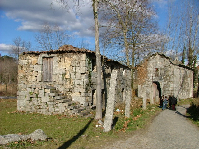
| Wow. Now that is old. Where was this taken? |
|
| Photographer found comment helpful. |
|
|
04/17/2005 01:55:54 AM |
Wow. Very difficult to comment about this one. First of all, this is a lovely shot. Probably my favorite so far. The people bothered me at first, but if you cover them up, there seems to be something lacking. Ideally, the 2 in black would have been perfect.
I love how the stone columns lead you right into the far building while the curve in the road gives the whole image motion. Job very well done. |
|
| Photographer found comment helpful. |
|
|
04/15/2005 02:28:22 PM |
| would look better w/out the prople other than that nice. 8 |
|
| Photographer found comment helpful. |
|
|
04/15/2005 02:02:03 PM |
| Great possibilities with this building. I would have gotten the people out of the shot. Also the light pole shadow is bad. IMO, a closer shot of the building with the stairs could have been awesome, especially with those pretty clouds. |
|
| Photographer found comment helpful. |
|
|
04/14/2005 09:43:12 AM |
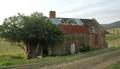
| Great looking buildings, but this compositon does not do them justice. Also the people do not add to the image. |
|
| Photographer found comment helpful. |
|
|
04/14/2005 09:16:22 AM |
| Great shot, very nice abandoned houses and beautiful sky. The only thing that bothers me is the people in the photo, I think it would have been better without it. I will give you 7. |
|
| Photographer found comment helpful. |
|
|
04/14/2005 08:40:11 AM |
| I would have liked it more with out the people cause you have a great subject and wonderful lighting and colors...also do wonder what b/w would look like. good luck |
|
| Photographer found comment helpful. |
|
|
04/13/2005 06:57:05 PM |
| Light - that's what lets this down. It could, in my view, be less over-exposed (this looks like what the makers of cameras think is an OK exposure), and the angle of light to your subject, an essential for communicating any sense of depth, of texture. This is obviously a fine subject for the challenge - but this presentation of it does it no favours |
|
| Photographer found comment helpful. |
|
|
04/13/2005 02:13:27 PM |
| Nice composition. I would like to see a tad more sharpness or crispness to this shot. The people are also distracting. |
|
| Photographer found comment helpful. |
Home -
Challenges -
Community -
League -
Photos -
Cameras -
Lenses -
Learn -
Help -
Terms of Use -
Privacy -
Top ^
DPChallenge, and website content and design, Copyright © 2001-2025 Challenging Technologies, LLC.
All digital photo copyrights belong to the photographers and may not be used without permission.
Current Server Time: 03/12/2025 02:17:22 PM EDT.