| Author | Thread |
|
|
04/09/2003 10:18:58 PM |
Greetings from the Critique Club
By Inspzil
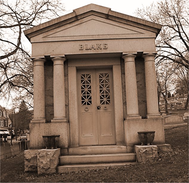
Composition - Definitely needs to be straightened up. That's a major qualm with the DPC voting population, me included. The other thing that is a killer is excessive background stuff, which is included on either side but particularly the left. I think the subject is a suitable one for the challenge, even though I'm sure some are doubting the true symmetry. Close enough for my money. The color tonality works for this photo really well. Nice job with that.
Technical - This is a little soft on the focus, which I don't thing really affects the picture that much. But DPC'ers hate things that aren't sharp. But the biggest thing about this photo IMO is the framing being crooked. I like how you did the color. It really makes the mood of this picture the way it was intended.
Overall - Straighten this out and crop it tighter to the building and I bet you add about 1 whole point to your score. Well maybe if you got it a little sharper too it wouldn't hurt. Personally I'm okay with it being a little soft. The idea was pretty good. It just needs a little better execution, which honestly is the easier of the 2 to fix. Good luck in future challenges - Inspzil |
|
Comments Made During the Challenge  |
|
|
04/06/2003 11:39:56 PM |
| wow, that's a name from my mother's side of the family, ever heard of any chakans? |
|
|
|
04/06/2003 01:09:16 PM |
| The fact that the photo is crooked really doesn't help in a "symmetry" challenge. |
|
|
|
04/04/2003 01:09:45 AM |
| I like your idea for this photo. I think it could be improved, though, by rotating the photo so that the line of the stairs is parallel to the bottom of the photo -- then the pillars would be perpendicular and the top of the roof would be dead center in the photo. And you would have a very dramatic example of symmetry. |
|
|
|
04/03/2003 01:17:38 AM |
| It's leaning to the left! Not a bad picture, a really good idea, but I think I would have cropped in to just the structure and straightened it out. |
|
|
|
04/01/2003 08:44:49 PM |
| Very nice symmetry... leaning perspective takes away from your shot, though, (in my opinion). |
|
 Photographer found comment helpful. Photographer found comment helpful. |
|
|
04/01/2003 07:56:19 PM |
| As for me I do not think that a rotated picture show good symetry. |
|
|
|
04/01/2003 12:01:27 PM |
| you have a tilt to the left you need to straighten it out-good tint-I know your on a hill |
|
|
|
04/01/2003 09:34:10 AM |
|
|
|
03/31/2003 05:28:36 PM |
| The picture is really titled to the left. I'm surprised how many off center photos I see. Seems like that would be the first thing to fix. I like the toning effect on the picture however. And to get a better effect of symetry maybe you should have zoomed in to the building a little more. |
|
|
|
03/31/2003 04:48:05 PM |
| Looks to be leaning left but still a nice job |
|
|
|
03/31/2003 03:30:40 PM |
| you should have straightened your shot! especially in a symmetry challenge! but that's just my humble opinion! |
|
|
|
03/31/2003 02:38:44 PM |
| you may need a slight clockwise rotation on this image to level it up just a bit :) - setzler |
|
Home -
Challenges -
Community -
League -
Photos -
Cameras -
Lenses -
Learn -
Help -
Terms of Use -
Privacy -
Top ^
DPChallenge, and website content and design, Copyright © 2001-2025 Challenging Technologies, LLC.
All digital photo copyrights belong to the photographers and may not be used without permission.
Current Server Time: 03/14/2025 06:02:51 AM EDT.