| Author | Thread |
|
|
06/13/2005 06:50:15 PM |
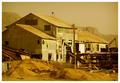
I've seen this shot with a different building before...
helpful huh? |
|
 Photographer found comment helpful. Photographer found comment helpful. |
|
|
04/27/2005 01:31:16 AM |
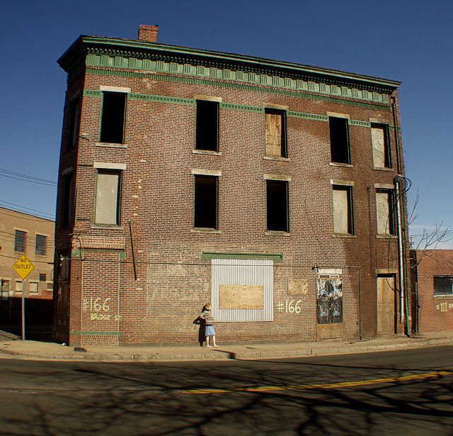
| I think I would have liked this much better if it had been in B/W. I think color is great for nature and portraits, but I don't believe it helps this type of shot at all. |
|
| Photographer found comment helpful. |
|
|
04/25/2005 09:53:39 AM |
| Like how you placed a person in the picture. I found most of the pictures uninteresting because they didn't have people in it. Good job. |
|
| Photographer found comment helpful. |
|
|
04/22/2005 06:31:10 PM |
| This is a great photo, should have scored a lot higher. You can feel the desolation and loneliness, even in broad daylight. This apparent contradiction makes it a very interesting photograph. I gave it an 8 and I'm glad 21 other people did. |
|
| Photographer found comment helpful. |
Comments Made During the Challenge  |
|
|
04/19/2005 06:44:14 PM |
| After alot of Bland Images , I enjoy the color in your shot, and damn thats WIDE!! Good entry - 8 |
|
| Photographer found comment helpful. |
|
|
04/18/2005 07:00:48 PM |
| The photo is fine except that it's boring - no offense. I think it would have had much more potential shot from a more dynamic angle. |
|
| Photographer found comment helpful. |
|
|
04/17/2005 06:35:11 PM |
| u got these sturdy lines reasonable under control and the girl adds to the mood |
|
| Photographer found comment helpful. |
|
|
04/15/2005 07:01:23 PM |
The distortion seems to add some speed, or some flow to the photo. Interesting effect.
The photo, like the title says, breathes 'abandoned'. The dark holes of the windows, the closed entries at ground level, ther empty tarmac, the empty sky (no clouds), trees without leafes.... The girl's only companion seems to be her shadow. 8 |
|
| Photographer found comment helpful. |
|
|
04/15/2005 07:05:59 AM |
great sharpness and the person adds context. i would have cropped a little closer
7
|
|
| Photographer found comment helpful. |
|
|
04/15/2005 12:09:58 AM |
| nice..........i gave a little "aawww" when I noticed her. good saturation, not over done., 9 |
|
| Photographer found comment helpful. |
|
|
04/14/2005 10:42:49 PM |
| think it would have been better closer. |
|
| Photographer found comment helpful. |
|
|
04/13/2005 03:02:25 AM |
| I like this shot. It seems lacking in something but at the same time it seems to have something special in it that makes me like it. The subject of the photo seems to be the person (although we know it's the building) which is placed pretty close to the center of the image, but the composition is still pretty nice. I really like the colors here, and all the textures. |
|
| Photographer found comment helpful. |
|
|
04/13/2005 01:57:10 AM |
| love the color pallate, thank you for including the entire building in your crop. Nice |
|
| Photographer found comment helpful. |
|
|
04/13/2005 01:15:07 AM |
| One of the better color shots I have seen for this challenge, love the NO OUTLET |
|
| Photographer found comment helpful. |
Home -
Challenges -
Community -
League -
Photos -
Cameras -
Lenses -
Learn -
Help -
Terms of Use -
Privacy -
Top ^
DPChallenge, and website content and design, Copyright © 2001-2025 Challenging Technologies, LLC.
All digital photo copyrights belong to the photographers and may not be used without permission.
Current Server Time: 03/12/2025 07:04:15 PM EDT.