| Author | Thread |
Comments Made During the Challenge  |
|
|
04/25/2005 01:54:56 PM |
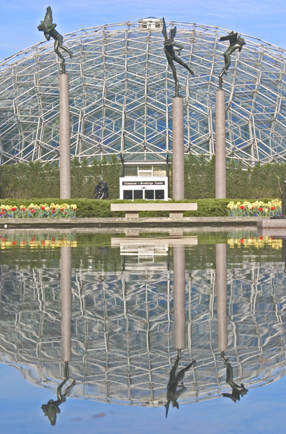
| great use of symmetry, a striking image. |
|
 Photographer found comment helpful. Photographer found comment helpful. |
|
|
04/24/2005 03:15:52 PM |
| Great Reflection! I would have cloned out the spots in the reflected sky ... 9 |
|
| Photographer found comment helpful. |
|
|
04/24/2005 12:10:37 PM |
| good pic. I think that the line where the reflection meets the real thing (horizon line) should be either higher or lower to follow the rule of thirds. my vote is higher. |
|
| Photographer found comment helpful. |
|
|
04/24/2005 10:31:05 AM |
| Levels look a little of. Would have liked to see a bit more contrast |
|
| Photographer found comment helpful. |
|
|
04/24/2005 10:13:54 AM |
You could darken this enormously, i think: in the sense that there are no blown-out highlights it isn't over-exposed of course; but in the sense that all the colours lack vibrancy, and a sense of contrast throughout the image, then it is over-exposed. Cameras meter in an odd way, and it's almost always worth shooting with the exposure compensation set down a stop or two: darker images can always be brought up in processing.
I think this scene is a bit complex to work well as a reflection: certainly at the submission size here. The figures, the dome, the flowers, the house, the greenery ... and the over-lapping of many of those leaves you with an image where there is too much stuff going on for the reflection to stand out. |
|
| Photographer found comment helpful. |
|
|
04/23/2005 11:34:56 PM |
| Colors are not clear and crisp. Interesting photo otherwise |
|
| Photographer found comment helpful. |
|
|
04/22/2005 09:51:32 PM |
| Looks over exposed to me. |
|
| Photographer found comment helpful. |
|
|
04/22/2005 01:16:51 AM |
| Composition and technique here is awesome, but just needs stronger colour to leap off the monitor screen. 8 |
|
| Photographer found comment helpful. |
|
|
04/21/2005 08:21:10 AM |
| Colors feel too flat in this image. Even a saturation boost would go a long way here. |
|
| Photographer found comment helpful. |
|
|
04/21/2005 03:40:50 AM |
| nice image but lacking contrast needs the tones darkened I feel but overal the image is good |
|
| Photographer found comment helpful. |
|
|
04/20/2005 04:05:14 PM |
| I like the reflection and framing. However, the shot looks a bit flat - could use more saturation and contrast. BOL |
|
| Photographer found comment helpful. |
|
|
04/20/2005 12:32:08 PM |
| I think more contrast would have improved this |
|
| Photographer found comment helpful. |
|
|
04/19/2005 10:36:47 PM |
| Great idea, good composition. On my screen it's a bit light... |
|
| Photographer found comment helpful. |
|
|
04/19/2005 02:23:34 PM |
| this image looks like it has a lot of potential, but seems a bit unfinished. it seems to be tilted a bit to the left, and is somewhat flat. could use a little more contrast, sharpening, and boosted saturization. all the same, nice image, good luck! |
|
| Photographer found comment helpful. |
|
|
04/19/2005 03:49:54 AM |
| Very interesting picture with the reflection in the water. The color seems a bit flat and dull - tweaking the levels just a bit would probably really make this a stand out picture. |
|
| Photographer found comment helpful. |
|
|
04/19/2005 03:22:26 AM |
| Interesting composition. It is very dull however. I bit more contract would have served it well. |
|
| Photographer found comment helpful. |
|
|
04/19/2005 12:23:59 AM |
| This is a really nice image. It seems a bit washed out, so you might want to boost the contrast a bit. But still, it's an excellent subject with great colors and patterns. |
|
| Photographer found comment helpful. |
Home -
Challenges -
Community -
League -
Photos -
Cameras -
Lenses -
Learn -
Help -
Terms of Use -
Privacy -
Top ^
DPChallenge, and website content and design, Copyright © 2001-2025 Challenging Technologies, LLC.
All digital photo copyrights belong to the photographers and may not be used without permission.
Current Server Time: 03/17/2025 06:11:40 AM EDT.