| Author | Thread |
|
|
05/01/2005 09:44:04 PM |
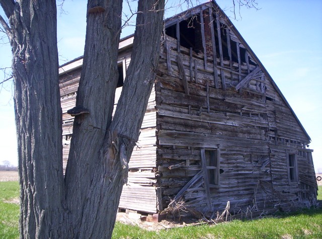
This is the thing man. When you place two onjects of attention in the same photo the compete for attention. Like I want to say, "what am I looking at the tree or the barn". In this photo it is a tie between the tree and the barn, and think about it have you ever seen a football game end in a tie. People relate photos to real life. They need somthing to be dominating or overpowering. They need a winner.
So what you have to do is always make sure that your pictures have a main subject. Also avoid distracting backgrounds. Thats why I think this photo did not do well. Somtimes people dont even know why they dont like a photo, they just dont like it. Mainly beacuse of a technical error in the the photo. The funny part of it is, they have know idea about the technical aspect of photography. That goes to show you, the technical stuff makes sence.
I reccommend the book Learning To See Creativily, it is a book you can pick up on amazon.com, (gives alot of tips). Well keep it up, dont give up or get discouraged. If you need any other help feel free to ask me.
Travis |
|
Comments Made During the Challenge  |
|
|
04/19/2005 11:55:01 PM |
| Nice work and it really shows abandonment... Things I would have changed personally about this photo is the angle (Location of the tree) it's very distracting and takes away from the actual interest point, the barn. Also, it seems a little over exposed on the left side of the barn. But overall nicely done. |
|
|
|
04/19/2005 10:12:27 PM |
| I think I would like this better if the tree wasn't so dominate in the photo. What does the O stand for? |
|
|
|
04/19/2005 06:47:31 PM |
| Another angle without the tree woulda worked better, the tree overpowers the scene, but you picked a good subject.. 6 |
|
|
|
04/18/2005 02:19:48 AM |
Interesting composition and had look at this one for a while to catch the meaning of the title.
:) |
|
|
|
04/15/2005 11:16:45 PM |
| The tree is a great way to help a difficult lighting situation. |
|
 Photographer found comment helpful. Photographer found comment helpful. |
|
|
04/15/2005 11:12:37 PM |
| I think for being 13 and this your first photo endeavor you did excellent! You have a great eye that I'm sure will develop over the years to come...just keep snapping and follow your gut.... |
|
| Photographer found comment helpful. |
|
|
04/14/2005 06:01:03 PM |
| Looks like it's coming down if the wind blows too hard. The building and tree fill the frame too much. It feels like there should be more to see. |
|
| Photographer found comment helpful. |
|
|
04/14/2005 03:47:50 PM |
| color balance shifted too blue |
|
| Photographer found comment helpful. |
|
|
04/14/2005 01:40:02 AM |
| I think that if the contrast and brightness were adjusted on this photo it would lend more to the detail of the scene. |
|
| Photographer found comment helpful. |
|
|
04/13/2005 03:52:09 PM |
| i'm left wondering the significance of the tree since it takes such a commanding position in this image. I found the O! |
|
| Photographer found comment helpful. |
|
|
04/13/2005 01:38:38 PM |
| Maybe check your colors. Look like a lot of magenta (red) tint. Of course if you did that for the affect, sorry. |
|
| Photographer found comment helpful. |
|
|
04/13/2005 10:15:39 AM |
| In my opinion if you cropped off about 1.5-2 inches off the left side of the photo it would have made for a beter submission. As it looks, it looks kinda blown out from the contrast of the sun on the left side and loses a lot of clarity/definition in the rest of the photo. The tree in the foreground is not needed to make this photo and I find it to be very distracting. Good luck in this challenge. |
|
| Photographer found comment helpful. |
Home -
Challenges -
Community -
League -
Photos -
Cameras -
Lenses -
Learn -
Help -
Terms of Use -
Privacy -
Top ^
DPChallenge, and website content and design, Copyright © 2001-2025 Challenging Technologies, LLC.
All digital photo copyrights belong to the photographers and may not be used without permission.
Current Server Time: 03/12/2025 06:16:06 PM EDT.