| Author | Thread |
Comments Made During the Challenge  |
|
|
04/18/2005 01:12:44 PM |
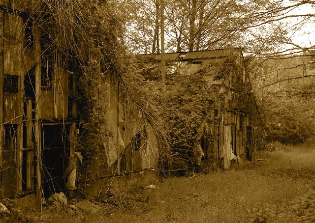
Good composition.
Toning is a bit harsh in my opinion. |
|
 Photographer found comment helpful. Photographer found comment helpful. |
|
|
04/17/2005 10:48:52 PM |
| not a bad picture, but it seems overly sepia-ed |
|
| Photographer found comment helpful. |
|
|
04/17/2005 07:30:51 PM |
| I'm not sure the sepia tone is helping this pic. I wonder how it would be in colour or black & white? |
|
| Photographer found comment helpful. |
|
|
04/16/2005 06:48:43 PM |
| The sepia tone doesn't work for me on this one. Everythigs seems to blend together. |
|
| Photographer found comment helpful. |
|
|
04/16/2005 03:10:25 PM |
| I could copy and past this to several other images in this challenge: The deep sepia obsures the details that are available in this image. By lightening the tone, the detail will emerge and the veiwer doesn't need to work to capture the feel, mood, emotion that should be come easily. (By the way, IMO) |
|
|
|
04/14/2005 10:28:52 AM |
| I know this is purely subjective....but I don't like the musturd color. It is very distracting to me. 5 |
|
| Photographer found comment helpful. |
|
|
04/13/2005 06:54:39 PM |
| Great perspective. Tone a little dark. Perhaps a green tint to fit your title? |
|
| Photographer found comment helpful. |
|
|
04/13/2005 12:56:51 PM |
| I like the subject and composition, but the flat contrast hides the textures instead of accentuating them. |
|
| Photographer found comment helpful. |
|
|
04/13/2005 07:56:52 AM |
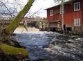
| wow excellent shots. could have been a touch brighter tho. Being that the image is so dark it loses a little bit of clarity and depth. I also think that you may get some low scores due to the composition of the shot and that it is small. I would love to see the original after the challenge is over tho if possible. <7> |
|
| Photographer found comment helpful. |
Home -
Challenges -
Community -
League -
Photos -
Cameras -
Lenses -
Learn -
Help -
Terms of Use -
Privacy -
Top ^
DPChallenge, and website content and design, Copyright © 2001-2025 Challenging Technologies, LLC.
All digital photo copyrights belong to the photographers and may not be used without permission.
Current Server Time: 03/16/2025 10:08:37 PM EDT.