| Author | Thread |
Comments Made During the Challenge  |
|
|
04/17/2005 09:16:49 PM |
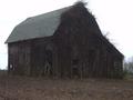
| Nice colors, but I wish the house was closer so I could make out more detail - can't really tell if it's abandoned or not. |
|
|
|
04/17/2005 08:48:04 PM |
| A liitle dark, you should have lightend it up with a little contrast. Nice photo though 5 |
|
|
|
04/16/2005 09:31:27 PM |
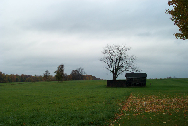
| I think it would have been a bit better without the tree on the right. |
|
|
|
04/15/2005 10:02:25 PM |
| Pleasant, but not the most effective composition or coloring. Too square on - I might have moved several feet (yards?) to the right, and angled it so the building line wouldn't be right along the horizon. |
|
|
|
04/14/2005 07:50:35 PM |
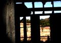
| I think this is an interesting building. I wish you would have moved in on it. This turned out to be more of a landscape picture instead of a building picture. Nicely done though |
|
|
|
04/14/2005 07:29:21 PM |
| Maybe the main focus of this shot is too distant? |
|
|
|
04/14/2005 05:50:03 PM |
Somehow the negative space in this photo doesn't work for me. I think part of it is that everything is a little bit too dark. You might consider using curves or levels in Photoshop to make everything lighter: certainly the subject, probably the sky, possibly the grass. I see the subject is placed neatly on the rule of thirds. It's a safe choice, but I tend to think that it's a little small to fill that space. I'd have been tempted to move it toward the corner by cropping off the tree on the right and an equal amount of grass - but I tend to crop more closely than the DPC group as a whole.
I like the bare tree and its relation to the house, and I think if you'd have been able to get closer or to use a longer lens, a shot with just the house, the tree, and the grass would have been better. |
|
|
|
04/14/2005 03:06:13 PM |
| your building is a little dark to see what it is represinting in the challenge which is a shame as the image is good, would have cropped the tree out at the top right as it looks unbalanced. |
|
|
|
04/14/2005 02:34:42 PM |
| not much detail on the subject itself, but a nice image |
|
|
|
04/14/2005 10:40:02 AM |
| I would have liked it a little lighter in order to see some details of the building. |
|
|
|
04/14/2005 09:38:52 AM |
| Unfortunatetly, all I can see here is sky, grass, and an out of focus, too dark , too small building. The tree limbs in the upper right corner should be cropped out. The angle seems ok, but a closer, tighter, lighter shot would have scored much higher from me. |
|
|
|
04/13/2005 05:58:50 PM |
| The image is very dark on my monitor, so it makes it difficult to make take in the image. |
|
|
|
04/13/2005 01:59:48 PM |
| Needs a tad more crispness and clarity, and the tree on the upper right is distracting. Maybe this shot at a different angle and a tad closer? |
|
|
|
04/13/2005 03:05:44 AM |
| The colors are very nice. It's kind of hard to tell that the house is abandoned as it is so small compared to the rest of the picture. I think taking a closer shot would have been nice - you could see the decay of abandonment. |
|
|
|
04/13/2005 02:59:41 AM |
Nice, simple shot. I like how the dead tree hovers over the building. The sky is dark and forboding, but lacks contrast. Also, the building is a bit too dark for its own good.
Average shot, I'd say. |
|
Home -
Challenges -
Community -
League -
Photos -
Cameras -
Lenses -
Learn -
Help -
Terms of Use -
Privacy -
Top ^
DPChallenge, and website content and design, Copyright © 2001-2025 Challenging Technologies, LLC.
All digital photo copyrights belong to the photographers and may not be used without permission.
Current Server Time: 04/27/2025 12:19:20 AM EDT.