| Author | Thread |
Comments Made During the Challenge  |
|
|
04/18/2005 11:11:47 PM |
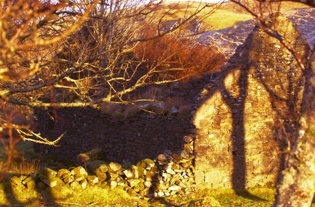
| Very, very hard to make out due to the dark area on the left side, and the house, ground and grass all being pretty much the same color. |
|
|
|
04/18/2005 02:09:31 PM |
| The color looks good, but the picture seems very busy. My eyes weren't sure where to focus. |
|
|
|
04/18/2005 10:18:20 AM |
| Could be a good picture but the shadows are VERY distracting... hard to make out what you were trying to take a picture of... |
|
|
|
04/17/2005 09:28:03 AM |
| Between the light the tree and the shadow it makes it difficult to see the building. A different angle or different light would be better |
|
|
|
04/15/2005 10:42:57 PM |
| colors and light seem too strong and vibrant. |
|
|
|
04/15/2005 03:07:06 PM |
| Colors are a little to saturated and light a little to harsh. |
|
|
|
04/15/2005 02:53:22 PM |
| Lots of distracting shadows ..... I don't see what you wanted to show us .... |
|
|
|
04/15/2005 02:52:58 AM |
I love the warm colors, but I have to admit it took me a sec for my eyes to adjust to see the rest of the building. I like the "through the trees" feel this picture has, like its as if is was stumbled upon while walking through the woods.
|
|
 Photographer found comment helpful. Photographer found comment helpful. |
|
|
04/14/2005 02:32:02 PM |
| there is alot going on in this image to clearly focus on the structure itself, focus is a bit in spots, but clearly charlie needs a new home |
|
| Photographer found comment helpful. |
|
|
04/14/2005 12:12:37 PM |
| I think the unnatural colors greatly detract from what could have been a really neat picture. The shadows on the wall are great. |
|
|
|
04/14/2005 11:41:29 AM |
| i feel like the colors and the branches is just a little too much...my first reaction when i opened it was that i didn't know what i was lookinb at. |
|
|
|
04/14/2005 09:21:10 AM |
| To me this would suggest ruins not abandoned. also find that because of the sun the colors all look yellow which I find very distracting as it puts a blurrish hue onto the photo. Perhaps a different time of day would have made for a better photo. Good luck in this challenge. |
|
|
|
04/13/2005 11:11:48 PM |
| Colors seem a little odd. |
|
|
|
04/13/2005 09:31:04 PM |
| the first thing i noticed with this was the over saturation of yellow, not to my liking. and the branch in the foreground is a bit distracting. |
|
| Photographer found comment helpful. |
|
|
04/13/2005 05:55:34 PM |
| I guess I am distracted by the foliage. The color is surreal. I keep thinking there should be more details in the shadows that would make this a better image for this challenge |
|
| Photographer found comment helpful. |
|
|
04/13/2005 12:26:06 AM |
| this looks over saturated |
|
| Photographer found comment helpful. |
Home -
Challenges -
Community -
League -
Photos -
Cameras -
Lenses -
Learn -
Help -
Terms of Use -
Privacy -
Top ^
DPChallenge, and website content and design, Copyright © 2001-2025 Challenging Technologies, LLC.
All digital photo copyrights belong to the photographers and may not be used without permission.
Current Server Time: 04/26/2025 07:47:33 AM EDT.