DPChallenge: A Digital Photography Contest You are not logged in. (log in or register
 
Challenge Entries
Portfolio Images
This image is not part of a public portfolio.
Retired
Retired
figment


Photograph Information Photographer's Comments
Challenge: Abandoned Buildings (Basic Editing III)
Camera: Fujifilm FinePix S7000
Location: Georgia
Date: Apr 11, 2005
Aperture: f3.1
ISO: 200
Shutter: 1/210
Date Uploaded: Apr 11, 2005

Looks best in b&w, but contest wanted color so I changed my submission. Goal here is to beat my dad, Popdeepop. He lives 400 miles away and this site has given us a way to be closer. Good Luck Pop!

Statistics
Place: 240 out of 500
Avg (all users): 5.1786
Avg (commenters): 6.8000
Avg (participants): 5.1630
Avg (non-participants): 5.2016
Views since voting: 894
Views during voting: 393
Votes: 308
Comments: 5
Favorites: 0


Please log in or register to add your comments!

AuthorThread
 Comments Made During the Challenge
04/19/2005 07:57:25 PM
this photo reminds me of down home north carolina. great shot
04/17/2005 09:45:12 PM
Good choice of subject. Lots of different material types, all of which you photographed very well.
04/14/2005 01:56:34 AM
Fine composition with leading lines, and interest in this old place. The sky is a bit washed out. I like the closer in crop.
  Photographer found comment helpful.
04/14/2005 12:23:09 AM
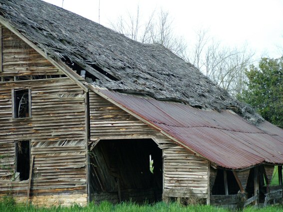
Interesting perspective here. True, the building is cut off, but in this case I can see that it makes for a strong composition. The roof offers a nice diagonal base splitting the picture and creating a pretty good balance of lines and texture in the wood of the structure and the more solid roof and sky. There is some nice texture going on by the way in your subject. I like the ominous feel of the blackness within the opeining, the viewer is left wondering what might be inside, another time of day with different lighting angles may have spoiled this, nice choice. In that respect lighting is good, however over all, IMO the llighting seems kind of flat in the shot. I'm wondering if maybe a little different adj. in levels or brightness may ad some pop? perhaps not. I know that often times it seems people do b/w just for the sake of it, but I'm thinking maybe in this shot it could be strong, really emphasizing the rich tone and texture of the wood and the roof, and bringing less into play the slightly drab lighting conditions. Perhaps even playing with hue/sat, in separate channels, kind of selectively desating, utilizing the strengths of the wood tones and primarily neutral colors? Overall, good job, nice photo. :-)
  Photographer found comment helpful.
04/13/2005 10:43:12 AM
Like this picture - the textures are great. The sky takes away from the pic a bit though (too washed out). Perhaps cropping lower would help.
  Photographer found comment helpful.


Home - Challenges - Community - League - Photos - Cameras - Lenses - Learn - Help - Terms of Use - Privacy - Top ^
DPChallenge, and website content and design, Copyright © 2001-2025 Challenging Technologies, LLC.
All digital photo copyrights belong to the photographers and may not be used without permission.
Current Server Time: 03/16/2025 07:35:17 PM EDT.