| Author | Thread |
Comments Made During the Challenge  |
|
|
04/19/2005 06:14:56 PM |
| This shot would be better if the highlights weren't so bright |
|
 Photographer found comment helpful. Photographer found comment helpful. |
|
|
04/19/2005 06:01:31 AM |
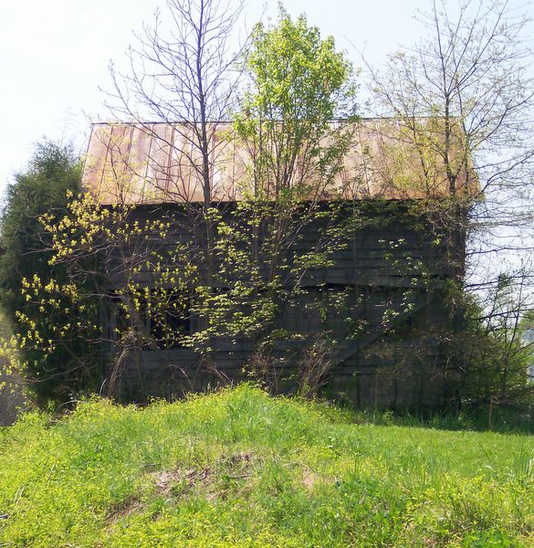
Image seems more about the foliage than the building in my opinion.
Perhaps a little more angle on the building would help the composition.
As a suggestion, try taking the image into Photoshop (assuming you have it), and in the Hue/Saturation adjustments, take the yellow channel hue and saturation to the right a little (may 10 pts) and bright the lightness down a bit (10-20 pts) to give the yellows more of a darker, richer green look, and bring the red saturation up just a little. |
|
| Photographer found comment helpful. |
|
|
04/18/2005 10:20:02 AM |
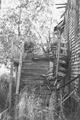
| Can't really see the buliding, but the trees I can. |
|
|
|
04/18/2005 10:06:31 AM |
| This image is neat, But i think there isd too much grass around the building, but nice shot |
|
| Photographer found comment helpful. |
|
|
04/17/2005 10:56:31 PM |
the trees make it hard to see the subject, maybe next time shoot the house on a side where the trees don't obstruct as much.
the sky needs more color, i would suggest a polarizing filter.
also, the subject is in the dead center of the picture. try the rule of thirds next time. |
|
| Photographer found comment helpful. |
|
|
04/17/2005 06:08:36 PM |
u got these colours rightt...feels like spring..yet the abandoned mood is preserved
a real nice one |
|
| Photographer found comment helpful. |
|
|
04/17/2005 06:05:07 PM |
| I think the color saturation distracts from the composition. |
|
|
|
04/14/2005 08:56:50 PM |
| This is a lovely picture, but doesn't feel abandoned. Also, too centered - crop all open area from the right? |
|
| Photographer found comment helpful. |
|
|
04/14/2005 06:06:39 PM |
| Too much tree to see through. The building looks interesting but it's just to hard to pick out. I do like the color though. |
|
| Photographer found comment helpful. |
|
|
04/14/2005 03:59:13 PM |
Not bad. I like the colors and detail. I think a different view, one without the trees in the way, might have worked better.
|
|
| Photographer found comment helpful. |
|
|
04/14/2005 11:00:34 AM |
| The photo looks washed out because of the contrast from the sun/sky. I also find the trees to be very distracting and takes a lot away from the building. I'm also not fussy on the size you have chosen (640x640). I find it gives an unnatural perspective to the photo. Good luck in this challenge. |
|
|
|
04/14/2005 09:35:56 AM |
| A little too much in the foreground, more of the building could help maybe. |
|
| Photographer found comment helpful. |
|
|
04/14/2005 12:32:12 AM |
| You've got a good idea going here. Catching the foiage/trees does ad some interest and nice vivid green coloring here, but in this case it might be just a bit too much. Seems to be kind of obscuring your main subject a little too much. Perhaps also framing out a bit of the foreground grass might help some too. Maybe keeping in mind the idea, but finding a different angle/perspective, showing more of the structure, but still with some trees/greenery would make for a stronger photo. |
|
| Photographer found comment helpful. |
|
|
04/13/2005 05:01:12 PM |
|
| Photographer found comment helpful. |
Home -
Challenges -
Community -
League -
Photos -
Cameras -
Lenses -
Learn -
Help -
Terms of Use -
Privacy -
Top ^
DPChallenge, and website content and design, Copyright © 2001-2025 Challenging Technologies, LLC.
All digital photo copyrights belong to the photographers and may not be used without permission.
Current Server Time: 04/26/2025 02:31:23 AM EDT.