| Author | Thread |
Comments Made During the Challenge  |
|
|
04/19/2005 06:40:29 PM |
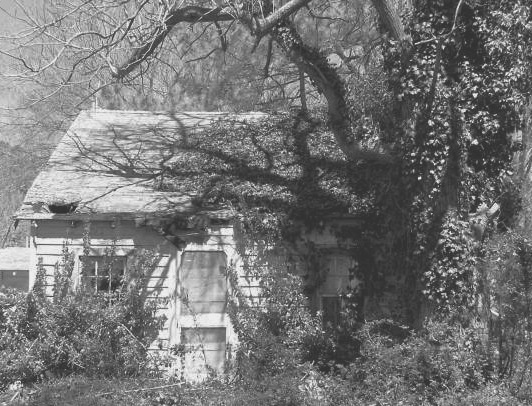
| It looks a bit too bright to me, like there's not enough contrast |
|
|
|
04/19/2005 02:51:28 PM |
This shot is screaming for a member challenge in order to burn / dodge it. Well seen!
The shadow on the house adds quite a different feel to it. Perhaps just a little darker would balance out the overall exposure levels. |
|
|
|
04/19/2005 12:37:09 PM |
| Lighting is beautiful. Old building someone once loved and you can imagine what it might have been like. Love the trees around it and the casting of shadows. Mary~ |
|
|
|
04/18/2005 06:54:37 PM |
| I think it would have been better with more contrast |
|
|
|
04/18/2005 06:19:22 AM |
| This is a great shot. Looks like it was taken 50 years ago. Great work! |
|
|
|
04/18/2005 03:24:35 AM |
| The shadow from the tree has a nice, sinister look, but the house itself seems very bright and counteracts the effect. Perhaps highlight reduction would have helped? |
|
|
|
04/17/2005 09:31:56 PM |
| Don't like the title - spooky house, instead of racially charged word, "spook". But beautiful photo. |
|
|
|
04/15/2005 11:16:53 PM |
| Too light. There just isn't enough contrast between light and dark. The building would have been a lot more prominent had you adjusted the black point. I think this is a good photo, but I think it could have been better. |
|
 Photographer found comment helpful. Photographer found comment helpful. |
|
|
04/15/2005 02:14:31 AM |
| Contrast is off on this image (IMO) adding contrast would add the detail and depth that is missing |
|
| Photographer found comment helpful. |
|
|
04/14/2005 01:29:47 PM |
| Good idea, but photo really needs some contrast. From what I can see it's nice and sharp. |
|
| Photographer found comment helpful. |
|
|
04/14/2005 11:50:57 AM |
| i feel this shot could use more contrast to make it stand out more. |
|
| Photographer found comment helpful. |
|
|
04/14/2005 02:13:28 AM |
|
| Photographer found comment helpful. |
|
|
04/14/2005 01:53:15 AM |
| Looks like a rural cottage in the sunshine to me, not a spook house. The shadows on the house are spooky, but are in competition with the sunshine and white siding. |
|
| Photographer found comment helpful. |
|
|
04/13/2005 06:54:09 PM |
| Picture quality is what's hurting here. |
|
| Photographer found comment helpful. |
|
|
04/13/2005 06:40:52 PM |
| Like the composition and tone used. |
|
| Photographer found comment helpful. |
|
|
04/13/2005 07:47:24 AM |
| interesting photo but way to washed out. It lacks clarity because of the contrast level and the shadow from the tree is very distracting. Good luck with this challenge. |
|
| Photographer found comment helpful. |
|
|
04/13/2005 05:53:25 AM |
| This is an excellent subject that would look better with quite a bit more contrast. Just try darkening the shot and then raising the white point to whatever level you like. It'll look great! :-) |
|
| Photographer found comment helpful. |
|
|
04/13/2005 03:33:39 AM |
Well, I like that building and that shadow across it is awesome, but the shot seriously lacks contrast. You should have upped it a bit.
I just tried it out and it helps a lot. |
|
| Photographer found comment helpful. |
Home -
Challenges -
Community -
League -
Photos -
Cameras -
Lenses -
Learn -
Help -
Terms of Use -
Privacy -
Top ^
DPChallenge, and website content and design, Copyright © 2001-2025 Challenging Technologies, LLC.
All digital photo copyrights belong to the photographers and may not be used without permission.
Current Server Time: 03/12/2025 09:33:06 AM EDT.