| Author | Thread |
|
|
04/20/2005 11:23:22 PM |
| should have placed higher. |
|
 Photographer found comment helpful. Photographer found comment helpful. |
|
|
04/20/2005 01:41:38 PM |
Ah - now I see what happened.
Recent PC upgrade/hardware changes.
Video setting was at 16 Bit color, not 32 Bit.
Was seeing some "odd" banding in a number of my other portfolio pics and had me wondering. Now at 32 Bit, it's back the way it should have been. |
|
|
|
04/20/2005 09:26:47 AM |
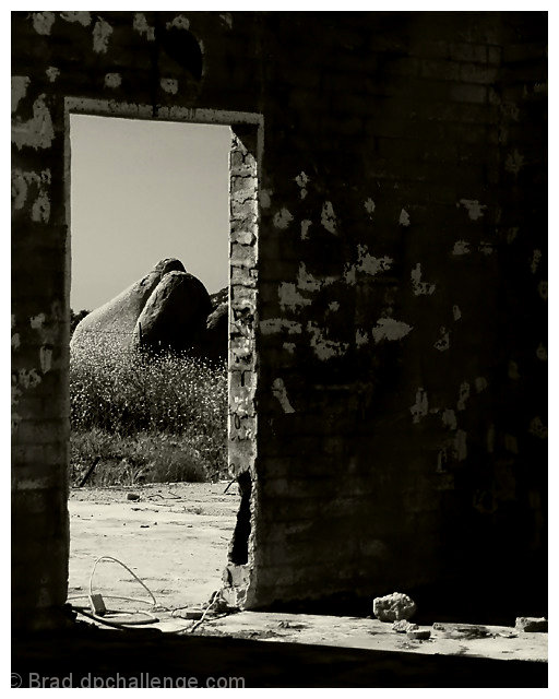
| I really liked this image. Cool composition with the door frame and light coming in across the bottom of the image at an angle. Nice contrast and tones. I had two minor nitpicks: 1) The wire (?) on the ground in the doorway I would have moved out of the way. 2) The doorframe (right edge) could have been a bit sharper. JMO. If the intent was to cast the viewer out the door to the view beyond (as your title suggests), then nevermind about nitpick number 2. ;^) |
|
| Photographer found comment helpful. |
|
|
04/20/2005 06:47:07 AM |
This was one of my favorite shots..lovely contrasts and composition...I thought it would be top 20..congratulations, anyway! I don't see any reddish bands on my monitor..if they are there, it's subtle.
Message edited by author 2005-04-20 06:48:54. |
|
| Photographer found comment helpful. |
|
|
04/20/2005 03:29:49 AM |
| very nice shot, good contrast...you made the right choice by submitting this one! |
|
| Photographer found comment helpful. |
|
|
04/20/2005 01:16:01 AM |
I saw them... Nice shot though.
Robt. |
|
| Photographer found comment helpful. |
|
|
04/20/2005 12:25:38 AM |
| i love this shot! the light falling through the door onto the dirt floor really makes it dramatic. should have placed much higher. (hug) |
|
| Photographer found comment helpful. |
|
|
04/20/2005 12:22:40 AM |
Now that's odd.
Those reddish bands in the sky were not there in post-processing, nor after the upload. Just saw them for the first time now. Odd...
Did anyone else see them during the challenge?
Message edited by author 2005-04-20 00:28:37. |
|
Comments Made During the Challenge  |
|
|
04/19/2005 12:20:15 PM |
| The play of light in this is beautiful....Really like it. Mary~ |
|
| Photographer found comment helpful. |
|
|
04/18/2005 11:57:29 PM |
| Imagine, creating a charming image out of ruins. Good job. 7 |
|
| Photographer found comment helpful. |
|
|
04/18/2005 12:09:59 PM |
| nice pix. whites need work. blacks good. nice texture. nice lighting. |
|
| Photographer found comment helpful. |
|
|
04/17/2005 02:53:14 PM |
This one belongs in an art gallery. Very well seen and photographed.
10 |
|
| Photographer found comment helpful. |
|
|
04/17/2005 09:15:10 AM |
| An image that benefits from simplicity. Lovely |
|
| Photographer found comment helpful. |
|
|
04/16/2005 10:45:06 PM |
| Great exposure; nice composition. |
|
| Photographer found comment helpful. |
|
|
04/16/2005 08:59:17 PM |
| This is a different shot,- great angle and composition. I like the b&w tone. Good job! |
|
| Photographer found comment helpful. |
|
|
04/15/2005 07:05:49 PM |
| I like the balance of the shadows and highlights here. Interesting how the light falls and reflects enough to show some of the interior. Stone vs Stone. 8 |
|
| Photographer found comment helpful. |
|
|
04/15/2005 03:10:25 PM |
| I like this,,a different look |
|
| Photographer found comment helpful. |
|
|
04/15/2005 11:49:58 AM |
| Darn, just not sure why this one isn't working for me. Too much interior? Rocks too strong/big in comparison? |
|
| Photographer found comment helpful. |
|
|
04/15/2005 10:38:47 AM |
| I like the extreme contrast of this image..the angularity of the door is nicely softened by the rounded rocks beyond...the shadows are intense..8 |
|
| Photographer found comment helpful. |
|
|
04/14/2005 08:04:00 PM |
| I like the clear contrast between the bare darkness of the interior and the clarity of the barren landscape outside. The white stains on the wall are a little distracting to me as they partly break the contrast. Saying that a great shot. |
|
| Photographer found comment helpful. |
|
|
04/14/2005 09:15:43 AM |
| A well composed shot but I'm not fond of the picture. Perhaps if the whole inside was lighter it would have a greater impact. Good luck in this challenge. |
|
| Photographer found comment helpful. |
|
|
04/13/2005 11:19:49 PM |
|
| Photographer found comment helpful. |
|
|
04/13/2005 07:45:30 PM |
|
| Photographer found comment helpful. |
|
|
04/13/2005 06:48:07 PM |
| I really enjoy this picture. I love the white spots on the wall that are picked up by the light coming through the doorway. |
|
| Photographer found comment helpful. |
|
|
04/13/2005 05:39:39 PM |
| A great image, but its not about the building, its about the landscape outside the building. |
|
| Photographer found comment helpful. |
|
|
04/13/2005 10:57:30 AM |
Very interesting and different image....I like the rock formation in the background maybe because I'm a guy......:-)........Don't know if you used a Tri pod for this but if you didn't I think you would have had a sharper image if you didn't. 5 |
|
| Photographer found comment helpful. |
|
|
04/13/2005 03:15:58 AM |
| Great shot. I love the lighting and contrast. |
|
| Photographer found comment helpful. |
|
|
04/13/2005 02:07:13 AM |
|
| Photographer found comment helpful. |
Home -
Challenges -
Community -
League -
Photos -
Cameras -
Lenses -
Learn -
Help -
Terms of Use -
Privacy -
Top ^
DPChallenge, and website content and design, Copyright © 2001-2025 Challenging Technologies, LLC.
All digital photo copyrights belong to the photographers and may not be used without permission.
Current Server Time: 03/13/2025 01:43:44 AM EDT.