| Author | Thread |
Comments Made During the Challenge  |
|
|
04/18/2005 12:17:19 PM |
| I'm not an expert but your green grass looks artificial, too bright. Not a bad shot, might have been improved with a non-centered compositions if possible. |
|
 Photographer found comment helpful. Photographer found comment helpful. |
|
|
04/18/2005 01:48:39 AM |
Meets the challenge head-on.
Perhaps time of the day is partly to blame, but overall the image is pretty harsh and lacking in detail. Not sure what software you are using, but I would suggest shifting the hue of teh yellow over slightly (to give it a more green look), while increasing the saturation a little and then darkening the yellow. Magenta could also use a little saturation boost and then a little darkening. |
|
| Photographer found comment helpful. |
|
|
04/15/2005 04:41:16 PM |
| A little too much saturation for my taste. Not sure if this was intented. |
|
| Photographer found comment helpful. |
|
|
04/15/2005 04:12:15 PM |
|
| Photographer found comment helpful. |
|
|
04/15/2005 12:45:55 PM |
| I like the colors, but it seems to fuzzy, my eyes have nothing to focus on. |
|
| Photographer found comment helpful. |
|
|
04/15/2005 04:55:01 AM |
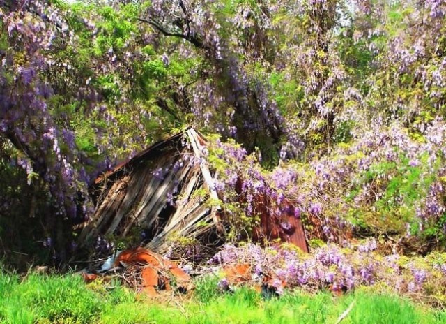
| Nice photograph with a fitting title. The color appears a little off to me. Too bright. I find all that foliage around the collapsed building quite distracting. I missed seeing the building at first through glance. Perhaps try a tighter crop. I like this shot. |
|
| Photographer found comment helpful. |
|
|
04/14/2005 11:26:26 PM |
| great colors. the focus looks a bit soft to me |
|
| Photographer found comment helpful. |
|
|
04/14/2005 08:55:10 PM |
| The building gets lost in the woods. Might try a tighter crop to see if you can make this more interesting. |
|
| Photographer found comment helpful. |
|
|
04/14/2005 01:35:41 PM |
| Colors look over saturated and greatly detract from what could have been a good photo. Not very sharp. I think would look somewhat better if the brightness was toned down. |
|
| Photographer found comment helpful. |
|
|
04/13/2005 06:06:37 AM |
| This could be a great image, but I'm bothered by the hot spots in the trees. I find that distracting, as it pulls my eye away from the main focus of the picture. I would have loved ot have seen this taken early in the morning or right aroud sunset. |
|
| Photographer found comment helpful. |
|
|
04/13/2005 03:38:38 AM |
|
| Photographer found comment helpful. |
Home -
Challenges -
Community -
League -
Photos -
Cameras -
Lenses -
Learn -
Help -
Terms of Use -
Privacy -
Top ^
DPChallenge, and website content and design, Copyright © 2001-2025 Challenging Technologies, LLC.
All digital photo copyrights belong to the photographers and may not be used without permission.
Current Server Time: 04/10/2025 08:43:33 AM EDT.