| Author | Thread |
Comments Made During the Challenge  |
|
|
04/19/2005 10:55:03 PM |
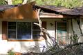
| This building looks like it has some interesting details, like the ironwork on the door and the stone. I'd like to have seen maybe some of that be the focus of your picture, I think it would have made it more interesting. |
|
 Photographer found comment helpful. Photographer found comment helpful. |
|
|
04/19/2005 04:53:32 PM |
| That is a cooooool door...if it's abandoned, you should get that iron (hinge?) off and use it at your house. |
|
|
|
04/19/2005 11:33:37 AM |
| the 7 dwarves must have moved... cool door. |
|
| Photographer found comment helpful. |
|
|
04/19/2005 07:40:40 AM |
Well seen.
Image is a little soft or out of focus and should be a bit sharper. A slight boost in saturation and slight decrease in brightness would richen this image up in my opinion. |
|
| Photographer found comment helpful. |
|
|
04/18/2005 03:35:13 AM |
| Cute. One announcement just wasn't enough. The image seems a little blurry, though. |
|
| Photographer found comment helpful. |
|
|
04/16/2005 01:21:58 AM |
| Would have been interesting to see more of this building |
|
| Photographer found comment helpful. |
|
|
04/15/2005 04:12:53 PM |
| the notices really make this shot. |
|
| Photographer found comment helpful. |
|
|
04/15/2005 03:12:49 PM |
| Overall colors seem a little mutted, so some of the detail and texture doesn't come through. |
|
| Photographer found comment helpful. |
|
|
04/14/2005 02:36:42 PM |
| meets the challenge, foreground focus may not totally be to my liking but a good entry |
|
| Photographer found comment helpful. |
|
|
04/13/2005 08:18:27 PM |
| a bit too shallow for Dof - I find the lack of focus foreground is distracting, as is the one light colored twig. |
|
| Photographer found comment helpful. |
|
|
04/13/2005 06:31:52 PM |
| I like this picture, but I find the twigs in the foreground distracting. Your contrast seems a bit off - the picture is murky. I don't like the perfect glass globe amidst all the decay. The thing I find most interesting in this picture is the ironwork on the door. Perhaps a different composition would help that stand out more. |
|
| Photographer found comment helpful. |
|
|
04/13/2005 05:24:23 PM |
| I really like the "Posted" sign on the door. It gives you the feeling of there being a story behind that house that used to belong to someone. I like your crop too. |
|
| Photographer found comment helpful. |
|
|
04/13/2005 05:37:16 AM |
| This could have been a great shot, with the warmth of the wooden textures against the cool colors and textures of the rocks surrounding the door, but this entire image lacks punch. It's flat and muddy, and needs some serious contrast for starters. Interesting composition, however <5> |
|
| Photographer found comment helpful. |
|
|
04/13/2005 12:25:15 AM |
| Pic seems out of focus and drab -- maybe B& W would do it more justice? |
|
| Photographer found comment helpful. |