| Author | Thread |
|
|
06/14/2005 04:56:04 PM |
| Love the depth of color!! Nice rich, and warm. The contrast is so good - I wonder what it would look like in black and white or in sepia, to evoke an old fashioned look. Just some fun suggestions. Very well done. |
|
 Photographer found comment helpful. Photographer found comment helpful. |
|
|
06/14/2005 04:07:32 PM |
| I love this little house. I could be happy here. |
|
| Photographer found comment helpful. |
Comments Made During the Challenge  |
|
|
04/19/2005 09:40:15 PM |
I'll move in!
Looks like a nice little house.. |
|
| Photographer found comment helpful. |
|
|
04/17/2005 05:43:49 PM |
| I think the color saturation distracts from the composition. |
|
|
|
04/17/2005 01:04:43 AM |
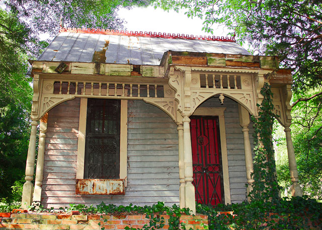
| Of all the buildings in this challenge, this one is probably among the prettiest and most interesting. A "straight-on" shot rarely provides the three dimensional quality that I like. However, you did achieve this with the columns and arches. Still, I can't help wondering if this shot wouldn't have been better with a slightly different point of view. But it is a very nice effort. |
|
| Photographer found comment helpful. |
|
|
04/16/2005 07:28:46 PM |
|
| Photographer found comment helpful. |
|
|
04/15/2005 09:59:05 PM |
| Disconcerting colors, lighting and angles. |
|
|
|
04/15/2005 03:54:13 PM |
| perhaps a little straight on but I like this shot rated it 8 |
|
| Photographer found comment helpful. |
|
|
04/14/2005 11:27:05 AM |
|
| Photographer found comment helpful. |
|
|
04/13/2005 10:19:43 PM |
|
| Photographer found comment helpful. |
|
|
04/13/2005 08:01:12 PM |
|
| Photographer found comment helpful. |
|
|
04/13/2005 01:26:16 PM |
| What a charming little building! |
|
| Photographer found comment helpful. |
|
|
04/13/2005 01:08:56 PM |
| Nice color. I think a lot of the details would have been lost if you'd chosen B&W. Good clarity. |
|
| Photographer found comment helpful. |
|
|
04/13/2005 01:14:05 AM |
A fun and colorful photo!
However, there are certain things here that irritate me.
1) I really, really don't like the overexposed white area above the house. A shorter exposure time and perhaps shooting in RAW-format might have helped here.
2) Instead of tilting the lens up you should instead tried to be somewhat further away from the building (and/or zoom away) and shoot straight on without tilting the camera and then crop in postprocessing.
3) I'd be curious to see more of the enviroment around the house.
4. I don't like how the columns to the left of the door obscure it. You should have been more the the right when taking the picture.
5) Perhaps some unsharp mask might have helped here? |
|
| Photographer found comment helpful. |
Home -
Challenges -
Community -
League -
Photos -
Cameras -
Lenses -
Learn -
Help -
Terms of Use -
Privacy -
Top ^
DPChallenge, and website content and design, Copyright © 2001-2025 Challenging Technologies, LLC.
All digital photo copyrights belong to the photographers and may not be used without permission.
Current Server Time: 03/12/2025 03:25:39 AM EDT.