| Author | Thread |
Comments Made During the Challenge  |
|
|
04/19/2005 05:54:05 AM |
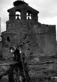
Met the challenge head-on!
A little high on the contrast side.
As a suggestion, try taking the image into Photoshop (assuming you have it), and in the Hue/Saturation adjustments, take the yellow channel hue and saturation to the right a little (may 10 pts) and bright the lightness down a bit (10-20 pts) to give the yellows more of a darker, richer green look, and bring the red saturation up just a little. |
|
|
|
04/15/2005 02:42:47 PM |
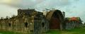
| Would have liked to see a bit better composition, rather than smack in the middle of the picture. I like the use of color. 6 |
|
|
|
04/13/2005 12:49:36 PM |
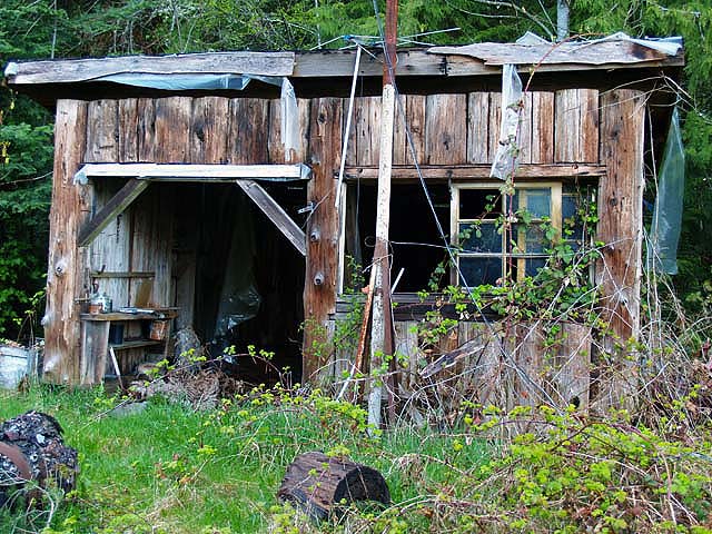
| Bit darker to get extra mood in picture .. ir |
|
Home -
Challenges -
Community -
League -
Photos -
Cameras -
Lenses -
Learn -
Help -
Terms of Use -
Privacy -
Top ^
DPChallenge, and website content and design, Copyright © 2001-2025 Challenging Technologies, LLC.
All digital photo copyrights belong to the photographers and may not be used without permission.
Current Server Time: 03/16/2025 05:11:56 AM EDT.