| Author | Thread |
Comments Made During the Challenge  |
|
|
04/05/2003 05:41:54 PM |
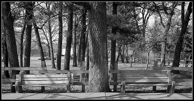
| Good idea. I like that the tree separates this into 2 sides, but I think there should be more contrast - the benches seem to blend in with the background |
|
|
|
04/02/2003 09:38:20 PM |
| Idea works. I think the tonal range is too narrow and the benches and tree are too blended together. I think setting the levels or increasing contrast would help. |
|
|
|
04/01/2003 10:37:13 PM |
| It was hidden, and normally I would want the benches to somehow stick out a little. But with this image, you show me that the benches are a part of this place, and not detached from it. |
|
|
|
04/01/2003 07:31:18 PM |
| I like the aspect ratio of this image. Also the border is nice and subtle. |
|
|
|
04/01/2003 01:59:44 PM |
| nice clear image, good idea |
|
|
|
03/31/2003 09:41:49 PM |
| Cool....I love the decision to go black and white...That was a good call. Tonal range is wonderful. Pretty! |
|
|
|
03/31/2003 03:19:40 PM |
|
|
|
03/31/2003 10:31:49 AM |
|
Home -
Challenges -
Community -
League -
Photos -
Cameras -
Lenses -
Learn -
Help -
Terms of Use -
Privacy -
Top ^
DPChallenge, and website content and design, Copyright © 2001-2025 Challenging Technologies, LLC.
All digital photo copyrights belong to the photographers and may not be used without permission.
Current Server Time: 03/13/2025 01:28:07 AM EDT.