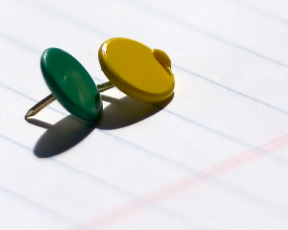
I thought the idea was inspired! The photo looked great at thumbnail size. It conveyed the idea well. At presentation size, the tacks somehow ceased to suggest shades. I think the lined paper posed a bit of a problem. I think focusing on the point of the tack instead of the 'lenses' hurt a bit. Finally, as decorative as green and yellow are together I wonder whether the image of shades could have been more strongly conveyed if the tacks had been green? For DPC voters who saw the ribboned entries from the portrait challenge, I have to wonder out loud whether shiny silver tacks would have worked better.
Hi Skip! Sorry it didn't fare so well. Here's my analysis, if you want one!
Hits: Composition and color is excellent! It has a very nice feel to it, with the color contrasts, and the contrast against the background. I also like the shadows you captured. The lines and angle of the paper works as well.
Misses: I am not a focus nut, and the focus seems ok, but not real sharp. I can't find anything that looks tack (sorry) sharp, though focus isn't bad. Subject wise, I'm not sure why you used the defective tack, it seems a distraction here. Subject wise: many people don't read titles, and even after reading this, I'm not sure I get the connection. I see someone sees sunglasses in the placement of the tacks--I am, despite my obviously warped imagination, finding it difficult to see them.
Summary: To me, this was a competent shot, which has nice aesthetics. It didn't single itself out at least to me as a strong subject, or as an artsy shot for the wall, and that's why I would have predicted an average score. On the other hand, it looks like it would make an excellent stock photography shot. (If you belong to one of those, you should consider that!)
Hope that analysis helps a little. I think you have a strong portfolio overall, and I wouldn't let one challenge result get to you!
I love your idea. It might have worked even better if both tacks were the same color since they're supposed to be sunglasses, and wish you had been able to get them at the same angle. Fun, regardless.
These tacks look so lonely. Good thing they have each other. Good macro. One of your tacks is broken. Color a little bit off but focus is there. 7 from me!