Greetings from the Critique Club!
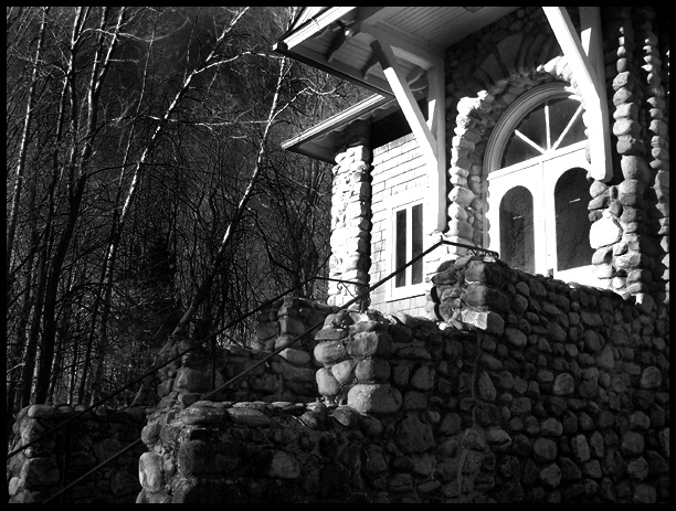
The first thing I notice in this picture is the front of the house: certainly that's strongly the focal point. Too much so, actually, as the house itself is very bright and the rest of the image very dark. The excessively high contrast makes this image unbalanced, and blown-out highlights are generally undesirable as well.
To cut down on this sort of thing, there are two things you can do: stick a neutral-density filter over your lens (such as a UV or Skylight filter, and even a polarizer might help), or simply expose for the highlights and fix the levels in Photoshop. In digital photography, one wants to make sure that the highlights are not overexposed even more than make sure that the shadows are not underexposed, which is the reverse of proper technique in film photography. I see in this picture a lot of rich detail in the shadows, which is great... but the detail needs to be in the highlight areas as well.
As this was a Free Study, there is not much to say about whether or not this meets the challenge. But I still might ask, what is it that made you pick *this* photo? Judging by the title, what caught your eye was the brilliant light on the facade of the house while the stairs leading up to it were still in shadow. Was this the best angle to depict this lighting? Did you try shooting from straight in front of the house, from the other side, with a looser or tighter crop? Not that this shot seems arbitrary, but these are just good general things to think about.
I hope you found this critique helpful, and good luck to you in future challenges!
Damon |