| Author | Thread |
Comments Made During the Challenge  |
|
|
04/21/2005 12:19:27 PM |
| Very cool. Refreshingly unique and pleasing to look at. |
|
 Photographer found comment helpful. Photographer found comment helpful. |
|
|
04/21/2005 11:51:44 AM |
| This is a nice picture. Good use of color and symmetry. |
|
| Photographer found comment helpful. |
|
|
04/19/2005 01:10:08 AM |
Color; Good
Exposure/Lighting: Fair
Composition: Good
Creativity/Originality; Good |
|
| Photographer found comment helpful. |
|
|
04/18/2005 09:36:56 PM |
| The compositon is a little hard to get oriented to, but, the lighting is very beautiful and carries the day. Creative. |
|
| Photographer found comment helpful. |
|
|
04/17/2005 08:53:42 AM |
| Great effect. This might be the winner. Good Luck. |
|
| Photographer found comment helpful. |
|
|
04/16/2005 10:45:08 PM |
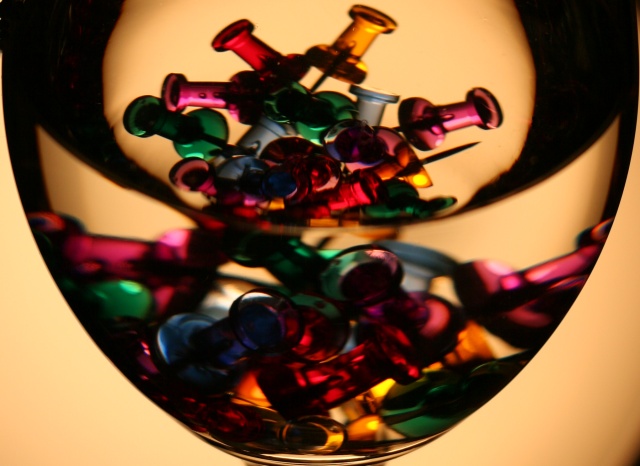
| How creative! This is beautiful (except that little dark spot in the corner, which I will not hold against you. |
|
| Photographer found comment helpful. |
|
|
04/16/2005 12:30:59 PM |
| I like the overall image. The one thing that distracts me and some may like it is the darkness at the top of the image. Gave it a 7. |
|
| Photographer found comment helpful. |
|
|
04/16/2005 10:54:24 AM |
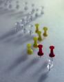
| There are no tacks in this image. ;) The color and focus are a little off but the concept is good. Think a white background would have worked better. 6 for the originality |
|
| Photographer found comment helpful. |
|
|
04/16/2005 06:33:58 AM |
| Perhaps it was a choice to use warm light for this shot, but I wonder whether it makes things look muddy in a way that detracts from the photo? The golden and red pins probably are improved by the look. The green and violet pins take on a moody smoky look which is interesting. I think it is the muddiness of the dark shadows that bother me most, and the odd color of the background highlights. ... Okay, after photoshopping the incandescent light out of it I realize that I'm no happier with the photo. I really love its colorful transparent elements individually, but there is something about the composition that still bothers me. |
|
| Photographer found comment helpful. |
|
|
04/16/2005 04:36:27 AM |
| A lovely combination of shapes and colours. It makes an ordinary object look special. |
|
| Photographer found comment helpful. |
|
|
04/16/2005 03:13:00 AM |
| Another classic DPC theme reprised in "tacks"... I wish the tacks were sharper, though. |
|
| Photographer found comment helpful. |
|
|
04/16/2005 01:35:22 AM |
| I think this could have used a bit more light |
|
| Photographer found comment helpful. |
|
|
04/16/2005 01:29:21 AM |
| WHITE BALANCE!!! Would have made this photo so much cooler.. |
|
| Photographer found comment helpful. |
Home -
Challenges -
Community -
League -
Photos -
Cameras -
Lenses -
Learn -
Help -
Terms of Use -
Privacy -
Top ^
DPChallenge, and website content and design, Copyright © 2001-2025 Challenging Technologies, LLC.
All digital photo copyrights belong to the photographers and may not be used without permission.
Current Server Time: 12/14/2025 07:22:12 PM EST.