DPChallenge: A Digital Photography Contest You are not logged in. (log in or register
 
Challenge Entries
Portfolio Images
This image is not part of a public portfolio.
Window Watcher
Window Watcher
love


Photograph Information Photographer's Comments
Challenge: Free Study VIII (Advanced Editing IV)
Camera: Olympus C-4000Z
Location: Window
Date: Apr 18, 2005
Date Uploaded: Apr 19, 2005

N/A

Statistics
Place: 485 out of 507
Avg (all users): 4.4163
Avg (commenters): 5.2500
Avg (participants): 4.3495
Avg (non-participants): 4.6809
Views since voting: 1001
Views during voting: 394
Votes: 233
Comments: 8
Favorites: 0


Please log in or register to add your comments!

AuthorThread
 Comments Made During the Challenge
04/25/2005 09:37:59 AM
This photo does not hold my interest for very long
04/24/2005 07:52:06 PM
this is an intriguing image, especially with such strong contrast. at this point, i have to believe i'm seeing exactly what you wanted me to see, the way it was intended. as much as i can appreciate that, i can only hope that the others are treating it favorably, as well. thanks for sharing!
  Photographer found comment helpful.
04/24/2005 02:08:57 AM
well, interesting, grainy and too washed out
04/23/2005 11:47:25 PM
too grainy and the window frame is too blown out for my taste
04/21/2005 09:52:52 PM
cool
  Photographer found comment helpful.
04/21/2005 04:47:07 PM
Very artistic and well composed.
  Photographer found comment helpful.
04/20/2005 01:38:24 PM
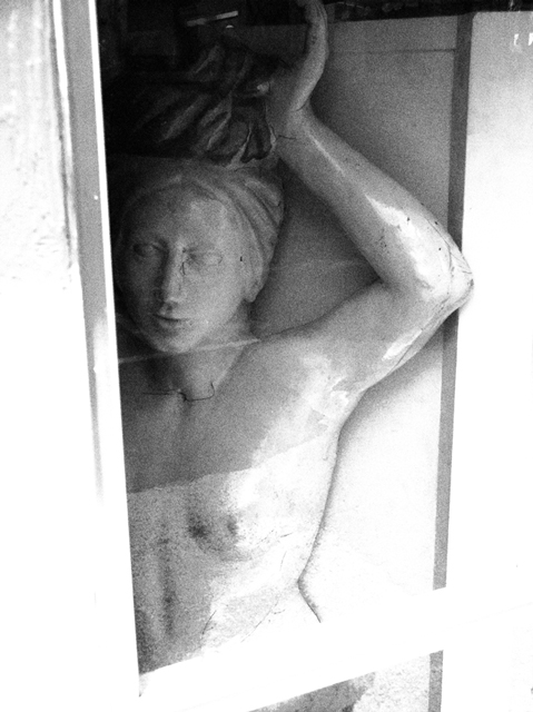
The worn, grainy look does much to humanize the figure. The angular lines and striations vs. the soft flow of greys and the grace of form provide a perfect poise between the nostalgic sentiment found here and a contemporary context. Despite the high-key manner, the contrast is kept conservatively contained in the shadows, which, effectively, avoids the potential impression of forced post-processing and artifice and, instead, credibly anchors the excess of light around a black point.

Given the gesture of the left arm and right-to-left gaze of the subject, the crop (centering the verticals vs. having the face further to the right) is, IMO, a plausible choice, as it likely minimizes the presence of redundant white space to the left of the niche.

The concentration of shadow toward the upper third of the picture is an oddity, which could, to my senses, be taken either as a distraction from familiar viewing habits or as a latent charm unique to the work.

This photograph has a strong personal appeal to me, probably because of the fine sensory poise and the aesthetic emphasis it affords anyone with an air for such things.
  Photographer found comment helpful.
04/19/2005 10:11:55 PM
I think that the highlights here are a little too hot to be effective. It seems like a difficult situation to meter, so maybe metering off of an 18% grey card may have been more effective to get th ebest of the shadows and highlights while keeping a steady midtone.


Home - Challenges - Community - League - Photos - Cameras - Lenses - Learn - Help - Terms of Use - Privacy - Top ^
DPChallenge, and website content and design, Copyright © 2001-2025 Challenging Technologies, LLC.
All digital photo copyrights belong to the photographers and may not be used without permission.
Current Server Time: 03/12/2025 09:01:33 PM EDT.