| Author | Thread |
Comments Made During the Challenge  |
|
|
04/26/2005 01:21:36 AM |
|
 Photographer found comment helpful. Photographer found comment helpful. |
|
|
04/25/2005 10:02:51 AM |
| Nothing seems in focus, everything is way too saturated. |
|
| Photographer found comment helpful. |
|
|
04/25/2005 08:55:29 AM |
| Looks a little out of focus. |
|
| Photographer found comment helpful. |
|
|
04/24/2005 09:34:37 PM |
|
| Photographer found comment helpful. |
|
|
04/24/2005 01:39:49 PM |
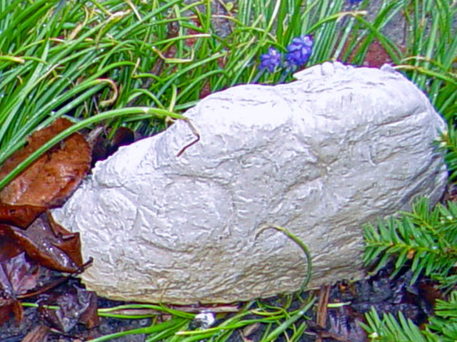
Doesn't look like a rock to me, I think you're trying to pull the wool over my eyes with a chunk of plaster or something.
:-) |
|
|
|
04/24/2005 01:24:49 PM |
| This looks a bit over processed. Just didn't please the eyes. Because of this, the rock looks very odd. THe highlights off of the rock also make it tougher to look at. |
|
| Photographer found comment helpful. |
|
|
04/24/2005 01:12:19 PM |
| This is a little out of focus. I don't do much better, but I'm going to keep trying and you should too. |
|
| Photographer found comment helpful. |
|
|
04/24/2005 02:33:21 AM |
| Post processing- Over did it. Out of focus. Nice combination of colors. |
|
| Photographer found comment helpful. |
|
|
04/21/2005 04:01:09 PM |
Your picture is out of focus and blown out on some parts of the rock. Switch your camera to 'macro' mode for close-up photographs. Reduce the exposure time or decrease your aperture to make your picture darker, in order to avoid areas of pure white.
I think a lower perspective would have improved this shot, as if a bug or an ant was seeing the stone. 3. |
|
| Photographer found comment helpful. |
|
|
04/21/2005 09:59:14 AM |
| Sorry--I would have voted higher, but it looks out of focus. |
|
| Photographer found comment helpful. |
|
|
04/21/2005 09:00:28 AM |
| out of focus... plus, I don't like the brightness of the colors, they seem too fake |
|
| Photographer found comment helpful. |
|
|
04/21/2005 08:32:42 AM |
| this wouldve probably been a great photo but it looks out of focus |
|
| Photographer found comment helpful. |
|
|
04/20/2005 04:45:47 PM |
| Nice composition, but, needs to be sharper. |
|
| Photographer found comment helpful. |
|
|
04/20/2005 04:32:35 PM |
| Photo appears to be oversharpened and still not sharp. Colors are too harsh for my eyes. The main subject is overexposed. |
|
| Photographer found comment helpful. |
|
|
04/20/2005 01:58:33 PM |
| Out of focus and over saturated. |
|
| Photographer found comment helpful. |
|
|
04/20/2005 02:22:03 AM |
| Lighting and focus seem abnormal. Highlights are blown at the top of the rock, leading to painful glare. |
|
| Photographer found comment helpful. |
Home -
Challenges -
Community -
League -
Photos -
Cameras -
Lenses -
Learn -
Help -
Terms of Use -
Privacy -
Top ^
DPChallenge, and website content and design, Copyright © 2001-2025 Challenging Technologies, LLC.
All digital photo copyrights belong to the photographers and may not be used without permission.
Current Server Time: 03/12/2025 03:02:48 AM EDT.