| Author | Thread |
Comments Made During the Challenge  |
|
|
04/13/2003 01:39:23 PM |
|
|
|
04/12/2003 12:16:19 PM |
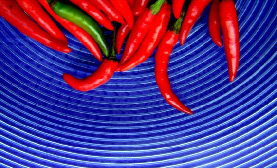
| Great idea and vivid color. It could have been in better focus. |
|
|
|
04/12/2003 12:00:24 PM |
| I like the saturation and color of this shot. I don't like the placement of the subject very much and I think it's blurry/grainy. |
|
|
|
04/12/2003 11:34:37 AM |
| I really like your idea here, but wish the chilies were in sharper focus. The color contrast and shape of the plate are visually interesting. |
|
|
|
04/11/2003 02:52:19 PM |
| great composition & color, incorporated contest theme |
|
|
|
04/11/2003 01:56:17 PM |
| seems to have lost some detail |
|
|
|
04/11/2003 01:43:19 PM |
|
|
|
04/11/2003 01:34:56 PM |
| The texture of this photo is nice. |
|
|
|
04/11/2003 11:22:27 AM |
| The chili's are out of focus. Possibly focusing on the chili's, then carefully dropping the camera down to take the rest of this picture would have helped. The ridges of the plate they are sitting on seems to be in focus. Should be the other way around. Composition could have been a little better by arranging the chilis so they take up the entire top portion of the plate and hang down in a more uniform pattern. I love the idea of the photo. I love the contrast in color. |
|
|
|
04/11/2003 09:15:09 AM |
| Good use of negative space and colours but make it symmetric by cropping the right out a bit would be nice IMO |
|
|
|
04/10/2003 08:32:21 AM |
| The reds look like they are pixelating just a little. The blue plate choice was a sound one. It makes the peppers really stand out. |
|
 Photographer found comment helpful. Photographer found comment helpful. |
|
|
04/10/2003 08:06:53 AM |
| what a nice composition.... perfectly cropped. i love this shot and post ! |
|
| Photographer found comment helpful. |
|
|
04/09/2003 03:08:37 PM |
hot! Great subject choice, but the focus seems quite soft ?
With all that blue 'sky' and those peppers 'reaching' up into it, I'd love to see this turned by 180 degrees... |
|
| Photographer found comment helpful. |
|
|
04/09/2003 01:41:19 PM |
|
|
|
04/09/2003 10:10:49 AM |
| It looks to me that you did too much in post processing. The peppers bleed into each other and their shine is not sharp like it is naturally. Good idea though. 5 |
|
| Photographer found comment helpful. |
|
|
04/09/2003 03:14:10 AM |
|
|
|
04/09/2003 01:33:18 AM |
| Very nice concept! Personall I feel it is upside down(but that's only opinion, I wouldn't deduct for it). There is definitely a problem with the lighting, a little too much on the bottom, which results in glare. |
|
| Photographer found comment helpful. |
|
|
04/08/2003 02:27:01 PM |
| nice idea nice use of color |
|
| Photographer found comment helpful. |
|
|
04/07/2003 02:50:01 PM |
| if only the chillies were clearer!! (and went further to the right) |
|
| Photographer found comment helpful. |
|
|
04/07/2003 02:34:36 PM |
| Pretty shot, not very crisp but pretty. |
|
| Photographer found comment helpful. |
|
|
04/07/2003 01:02:41 PM |
| nice idea, i may have shown more of the chiles and less of the plate but this is good |
|
| Photographer found comment helpful. |
|
|
04/07/2003 10:09:48 AM |
|
|
|
04/07/2003 12:20:09 AM |
| I really love this shot. It looks like a little bit higher f stop might have helped the peppers to be as clear as the plate. 8 |
|
| Photographer found comment helpful. |
Home -
Challenges -
Community -
League -
Photos -
Cameras -
Lenses -
Learn -
Help -
Terms of Use -
Privacy -
Top ^
DPChallenge, and website content and design, Copyright © 2001-2025 Challenging Technologies, LLC.
All digital photo copyrights belong to the photographers and may not be used without permission.
Current Server Time: 03/12/2025 07:51:49 AM EDT.