| Author | Thread |
Comments Made During the Challenge  |
|
|
05/03/2005 08:39:14 AM |
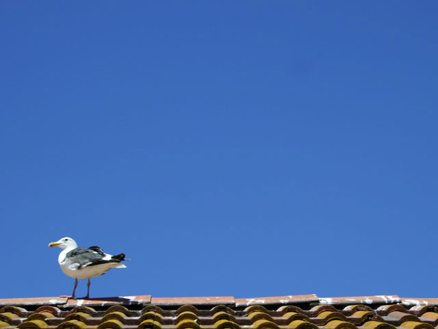
| Nice blue sky. I think more open space in front of the seagull would be better. 6 |
|
|
|
05/03/2005 12:18:47 AM |
| The bird placed at this position in the frame while facing that direction adds visual tension to the image and makes me want to turn to see what's off to the left. Good use of colors and textures. |
|
|
|
05/01/2005 05:56:07 PM |
|
|
|
04/30/2005 07:57:32 PM |
| Good pic. Needs better composition. |
|
|
|
04/29/2005 02:15:36 PM |
| Nice deep blue sky. Good framing. |
|
|
|
04/29/2005 01:29:25 PM |
| Minimalism with texture and nice colors! Great! 10 |
|
|
|
04/29/2005 08:14:43 AM |
| Does the sky and roof work together! |
|
|
|
04/29/2005 02:58:44 AM |
| i like the tightly cropped roof |
|
|
|
04/28/2005 07:46:06 PM |
| The seagull is a bit over exposed and a tad out of focus. A faster shutter speed would have helped this. good use for staying on topic though. |
|
|
|
04/28/2005 10:14:07 AM |
| oh I love this one! on the roof in front of my window there is a pair of seagulls, with their nest and eggs (I'm waiting to see the newborn...) and I tried to do a picture like this, but the result was very poor, the roof is too far for my camera lenses and pixels :) I'm telling you this to explain my strong emotive response to this picture which makes me liking it very very much! on the technical side, I'm not an expert, but I think the colors are great, focus and definition are fine, the size of the bird compared to the whole picture is absolutely perfect, for me. 10! and good luck ;) |
|
|
|
04/28/2005 02:41:44 AM |
| The empty sky does not add anything to the photograph. It would've been better is the seagull had been taking off into the emptiness of the sky. |
|
|
|
04/27/2005 05:36:21 PM |
| *shrug*, doesn't do much for me, 3 |
|
|
|
04/27/2005 02:23:10 PM |
| Nice. I like the way you positioned the gull in such a way as to make us wonder what it's looking at. |
|
|
|
04/27/2005 11:28:31 AM |
| I like this but maybe you could get him to turn his ass away from the camera ;) |
|
|
|
04/27/2005 10:04:17 AM |
|
|
|
04/27/2005 08:57:00 AM |
| A difficult image to comment on really, it has simplicity and is minimal, but the elegance I associate with minimalism is lacking |
|
|
|
04/27/2005 03:08:08 AM |
Nice presentation. Technically sharp, focused, detailed, and processed without distracting artifacts. Nice clean sky. Love the color saturation.
I propose cropping the roof even tigher...just below the top tiles. Well done. |
|
Home -
Challenges -
Community -
League -
Photos -
Cameras -
Lenses -
Learn -
Help -
Terms of Use -
Privacy -
Top ^
DPChallenge, and website content and design, Copyright © 2001-2025 Challenging Technologies, LLC.
All digital photo copyrights belong to the photographers and may not be used without permission.
Current Server Time: 03/12/2025 02:47:50 AM EDT.