| Author | Thread |
Comments Made During the Challenge  |
|
|
05/01/2005 03:17:56 PM |
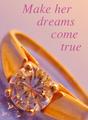
| Ring looks nice, but I don't think connotations of divorce are the way to go when advertising wedding rings, even if you do take trade ins. |
|
|
|
05/01/2005 11:32:50 AM |
| LOL, I like this. Not sure how well it would work as an advertisment, but I like it. LOL |
|
|
|
05/01/2005 10:48:20 AM |
| I like the long shadows in this shot...helps with the mood. Also, I like how the reflection and shadow inside the ring looks like a dividing cell, also a fitting relationship to the shot. |
|
 Photographer found comment helpful. Photographer found comment helpful. |
|
|
05/01/2005 01:16:19 AM |
| Nice dramatic lighting, but i don't think you want to advertise divorce as part of selling the jewelry :) sales might not go well. overall great photo GL! |
|
|
|
04/30/2005 07:39:59 PM |
| Good idea I would like a little fill light to lighten the shaow from the ring 7 |
|
| Photographer found comment helpful. |
|
|
04/30/2005 02:33:54 PM |
| Not really a great add for jewelry, but a very compelling photo 6 |
|
|
|
04/29/2005 03:56:44 PM |
|
|
|
04/29/2005 08:56:18 AM |
| Interesting idea! The only thing I find distracting is that big shadow from the ring. |
|
|
|
04/28/2005 10:14:40 PM |
| Good use of DOF, well done |
|
|
|
04/28/2005 02:07:43 PM |
|
|
|
04/28/2005 12:52:52 PM |
| Good composition and good use of shalow DOF. Ring is well lit with no blown highlight. Pleasing color balance. However, the shadow casted by the ring is way to strong I think. Maybe having another diffuse light source would have reduce the shadow. |
|
| Photographer found comment helpful. |
|
|
04/28/2005 09:41:53 AM |
|
|
|
04/28/2005 02:13:15 AM |
| Ouch! Seriously, nice photo. Well done! |
|
|
|
04/27/2005 09:55:28 PM |
| I like this. The humour is great. The strong shadow coming off the ring is unfortunate. |
|
| Photographer found comment helpful. |
|
|
04/27/2005 06:15:42 PM |
| Good shot, not much of an ad though!! |
|
|
|
04/27/2005 02:08:26 PM |
| Great sense of humor and idea well presented. Bumping up. |
|
|
|
04/26/2005 05:53:06 PM |
| Too funny, I sense a bitter, bitter person. I think this would be a great theme for a divorce Attorney. very crisp and well put together. |
|
|
|
04/26/2005 05:33:59 PM |
| I like the DOF and general compositon. The reflections inside the ring detracts. |
|
|
|
04/26/2005 12:44:21 PM |
| Awww. . . how sad. But a nice ad. |
|
|
|
04/26/2005 02:15:11 AM |
| Very sad, been there, done that! that even looks like my wedding ring! LOL! |
|
|
|
04/25/2005 09:05:47 PM |
| painfully clever, good shot |
|
|
|
04/25/2005 05:46:06 PM |
| Funny or sad? Yuo certainly have a good sense of humour. ;-) I don't know about a jewel ad though. LOL. Amusing for a second, but looses its charm rapidly. Good luck!. :-) |
|
|
|
04/25/2005 05:31:40 PM |
| LOL, cool shot. Did you intend for the light to be golden yellow and the wb to be this way? Works well, better than a white sheet of paper. The yellowish light goes well with the ring. |
|
|
|
04/25/2005 04:32:13 PM |
| Just a little too depressing. Good DOF control. |
|
|
|
04/25/2005 03:44:16 PM |
| Cute. Good detail and clarity on the ring. |
|
|
|
04/25/2005 01:30:30 PM |
|
|
|
04/25/2005 12:22:22 PM |
| In my opinion, no jewelry advertising in the world would link jewelry (a symbol of love) with divorce. It would be bad advertising and would, again in my opinion, depress sales. So from my viewpoint, this is bad advertising at best and fails to meet the challenge at worst. Now to the photo. The ring is beautifully focused and clear which is not so easy. It is well lit and I like the reflections. The blurred text looks like it was done with gausian blur, rather than DOF. It therefore looks a bit artificial. With DOF blur, the letters further away would be blurred more. As it is, all the letters are blurred more or less equally. |
|
|
|
04/25/2005 11:53:04 AM |
| Nice title and nice photo. Well done. The glare inside the ring is the only distraction on this photo. I would have tried the lights more so above the ring. Still I like the content. |
|
|
|
04/25/2005 10:10:11 AM |
| awww...what a sad concept. Nice picture though. I like the moody lighting |
|
|
|
04/25/2005 03:57:47 AM |
An unusual twist in the world of jewellery advertising - trade ins.
:)
|
|
|
|
04/25/2005 01:51:23 AM |
| awwww sad...will it sell the jewelry? gl with challenge |
|
|
|
04/25/2005 12:48:56 AM |
| this is nice - except for black area in upper left hand corner |
|
Home -
Challenges -
Community -
League -
Photos -
Cameras -
Lenses -
Learn -
Help -
Terms of Use -
Privacy -
Top ^
DPChallenge, and website content and design, Copyright © 2001-2025 Challenging Technologies, LLC.
All digital photo copyrights belong to the photographers and may not be used without permission.
Current Server Time: 03/12/2025 07:12:30 PM EDT.