| Author | Thread |
Comments Made During the Challenge  |
|
|
05/02/2005 10:40:50 PM |
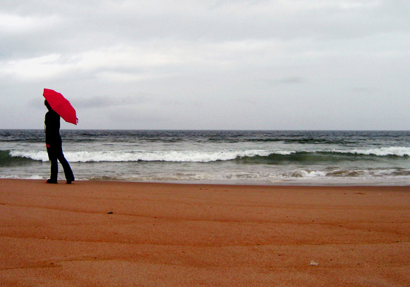
| interesting framing and colors |
|
 Photographer found comment helpful. Photographer found comment helpful. |
|
|
05/02/2005 10:29:54 PM |
| Nice contrasting colors, but I prefer more open space in front of subjects. 6 |
|
|
|
05/01/2005 08:49:51 PM |
| I really like your title. The photo is great too. The red umbrella really makes the photo... 9 My favorite so far. |
|
| Photographer found comment helpful. |
|
|
05/01/2005 05:52:05 PM |
|
| Photographer found comment helpful. |
|
|
05/01/2005 04:36:41 PM |
| definitely the centerpiece, but some obstructions in the sand confuse my eyes |
|
| Photographer found comment helpful. |
|
|
05/01/2005 03:01:43 PM |
| My first impression was: the colours are just too rich for a grey day. I like this shot, I like how the person is walking out of the picture, and I love the red umbrella. |
|
| Photographer found comment helpful. |
|
|
04/30/2005 06:53:03 AM |
| Love the colors... In Florida, the sand doesn't look like that... Neither does the water... I like this more and more as I look at it - man... the color is spectacular!! sorry for being repetitive. 8 :) |
|
| Photographer found comment helpful. |
|
|
04/30/2005 01:24:20 AM |
| Nice, gave it a 7, seems to meet the challenge well. |
|
| Photographer found comment helpful. |
|
|
04/29/2005 03:01:52 PM |
| like the red umbrella. Guessing you bumped up the red channel because the sand and hand are off color. Maybe complete desat except for red channel would have worked here with a little bump up in the contrast in the clouds. As it is, I give you an 8 for the composition, point of view and crop. Would have liked slightly more drama here - its almost speaking to me, but not quite. working with the tones and colors would improve the score. Really like this image - let me know if you do any further work with it. I'd love to see the results! |
|
| Photographer found comment helpful. |
|
|
04/29/2005 03:08:40 AM |
| Red is just too saturated for me. |
|
| Photographer found comment helpful. |
|
|
04/28/2005 09:57:22 PM |
| Good choice having a red umbrella in the guys hand. Great split of the scene with the beach water and sky. |
|
| Photographer found comment helpful. |
|
|
04/28/2005 08:53:00 PM |
| nice photo....love the mood and colors....a 10 from me! |
|
| Photographer found comment helpful. |
|
|
04/28/2005 04:20:26 PM |
| Maybe a little over cooked on the red. |
|
| Photographer found comment helpful. |
|
|
04/28/2005 03:29:10 PM |
| Very nice photo. Gorgeous colors. Would better fit the challenge description (IMO) if either a) it had more beach, less sky or b) had more sky, less beach. Also would like to see subject entering the pic rather than leaving it; this almost feels like the subject is abandoning the pic. |
|
| Photographer found comment helpful. |
|
|
04/28/2005 01:26:56 PM |
| good idea, but not very sharp |
|
| Photographer found comment helpful. |
|
|
04/28/2005 11:24:17 AM |
|
| Photographer found comment helpful. |
|
|
04/28/2005 01:34:55 AM |
| This is really sweet. It's so close to perfect in its balance that I find myself REAKKY wishing you'd taken the time to square the horizon precisely; that would make a noticeable difference on this image. I love the tonalities of it. |
|
| Photographer found comment helpful. |
|
|
04/27/2005 07:03:03 PM |
| Ouch .. Would have been perfect (in my opinion) if there was more space in front of the person (not much more, just a little bit) and more sky also and less sand or the opposite more sand and less sky. |
|
| Photographer found comment helpful. |
|
|
04/27/2005 06:31:03 PM |
| I would suggest for this one instead that the red on the umbrella be singled out, and the rest, desaturated, t;would offer better attention to the main subject, and ya, by the way, nice work though, 6 |
|
| Photographer found comment helpful. |
|
|
04/27/2005 06:22:33 PM |
| Love the red, would have like to seen it with a nice blue sky. And you say why would they have an umbrella if the sky was blue, But thats the point. They wouldnt. Which would grab attention. |
|
| Photographer found comment helpful. |
|
|
04/27/2005 05:49:14 PM |
| Interesting composition. The book says to have the subject moving into the picture, but I like this moving out. |
|
| Photographer found comment helpful. |
|
|
04/27/2005 05:13:11 PM |
| This is beautiful. Your small subject is definitely strong. I like this one a lot! |
|
| Photographer found comment helpful. |
|
|
04/27/2005 01:00:54 PM |
| its a good shot, though you fell victim to having the frame split in half. Nex time, when composing the shot, place the man at intersecting thirds. This will give a greater impact on the photo. I know that this was a basic challenge, but perhaps you could do some slight burning of the clouds to give them some impact. Maybe even some levels might make them jump out some more. |
|
| Photographer found comment helpful. |
|
|
04/27/2005 03:03:01 AM |
| Nice use of color. The bright red umbrella against the desaturated sky and ocean really catches the eye, and the red sands break the tedium. |
|
| Photographer found comment helpful. |
Home -
Challenges -
Community -
League -
Photos -
Cameras -
Lenses -
Learn -
Help -
Terms of Use -
Privacy -
Top ^
DPChallenge, and website content and design, Copyright © 2001-2025 Challenging Technologies, LLC.
All digital photo copyrights belong to the photographers and may not be used without permission.
Current Server Time: 03/12/2025 02:59:42 PM EDT.