| Author | Thread |
|
|
05/04/2005 12:05:00 AM |
| Thanks for all of the comments. My first contest so I learned a lot thanks to all of you! |
|
Comments Made During the Challenge  |
|
|
05/03/2005 10:52:26 PM |
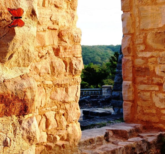
| I think there is a little too much detail in the rock and all the other background elements. 5 |
|
 Photographer found comment helpful. Photographer found comment helpful. |
|
|
05/03/2005 02:00:17 PM |
| a beautiful shot, seems to be more about the stones and their contrast with the green and blue through the window. If the butterfly is your subject, i would have tried to crop out the outside entirely, and have an analagous color scheme, because i love how the butterfly looks against the castle wall, 7 |
|
| Photographer found comment helpful. |
|
|
05/03/2005 03:33:59 AM |
| If not for the title I probably would have missed the butterfly entirely. A shallower DOF would have helped to guide the viewer to the intended focal point. Because of the composition I was looking for a subject through the stone opening. |
|
| Photographer found comment helpful. |
|
|
05/02/2005 03:32:47 AM |
| in this photo, the attention is drawn to the opening, not to the butterfly. |
|
| Photographer found comment helpful. |
|
|
05/01/2005 03:33:56 AM |
| Hmm IMO the concept is fundamentally wrong... most people would expect to see the door leading to your subject... A 6 for your efforts. |
|
| Photographer found comment helpful. |
|
|
05/01/2005 12:28:34 AM |
The butterfly sorta looks like you just stuck it there, I dunno.
And I'm sure you've heard it but your sky is blown out |
|
| Photographer found comment helpful. |
|
|
04/30/2005 04:53:37 PM |
| i like the idea and if you consider the butterfly to be the subject of your picture then it fits minimalism. unfortunately the challange states that your subject also has to be the strong point of your submission which in this case i do not believe to be true. the opening in the wall (some i guess call it a window...) is far more dominant than the butterfly. you still achieved a very high score because this is a really beautiful photo and i can see where you tried to fit the theme. the only other comment i have about the picture itself is that the sky seems a bit overexposed which is dissappointing becasue of all the other beautiful colors in the photograph. B+ or an 8 may bump later |
|
| Photographer found comment helpful. |
|
|
04/29/2005 10:01:34 PM |
| i looked at this image for a good minute wondering what the subject was - and i even had to look longer after i saw the title. My eye was drawn to the window, not the butterfly. Admittedly i had just woken up, but still the subject should not so hard to find imho. |
|
| Photographer found comment helpful. |
|
|
04/29/2005 02:33:32 PM |
| The butterfly on the wall is beautiful! IMO, if you cropped off the view and just had the butterfly and wall it would fit the challenge better. Nice colors and detail. |
|
| Photographer found comment helpful. |
|
|
04/29/2005 11:28:18 AM |
| this is very pretty, the glowing sun on the stones, makes the butterfly hard to see. But a great image and still give a ... |
|
| Photographer found comment helpful. |
|
|
04/29/2005 11:24:23 AM |
| I love that you got a butterfly in the this shot, that must have been hard to do! However, I almost didn't notice it because the dark portion of the photo drew my attention too much. Beautiful scenery! |
|
| Photographer found comment helpful. |
|
|
04/29/2005 11:12:24 AM |
| Without the title, I wouldn't have know that the butterfly was the subject. |
|
| Photographer found comment helpful. |
|
|
04/29/2005 03:48:45 AM |
| I wonder if it would look better with only the left hand wall? |
|
| Photographer found comment helpful. |
|
|
04/28/2005 04:49:31 PM |
|
| Photographer found comment helpful. |
|
|
04/28/2005 11:41:55 AM |
| The window is very distracting. This should have been cropped so that only the butterfly and the rocks were visible. |
|
| Photographer found comment helpful. |
|
|
04/27/2005 10:46:39 AM |
| To much distraction from the butterfly. |
|
| Photographer found comment helpful. |
|
|
04/27/2005 09:29:10 AM |
| Nice photo, just took me too long to find the subject. Didn't even find it until I read the title. |
|
| Photographer found comment helpful. |
|
|
04/27/2005 06:46:39 AM |
| Minimal yes, but doesn't have the simple elegance I associate with minimalism. Not sure the view doesn't take away the attention from the butterfly too much |
|
| Photographer found comment helpful. |
|
|
04/27/2005 04:37:36 AM |
| The butterfly does not seem to be the captive part of this image |
|
| Photographer found comment helpful. |
|
|
04/27/2005 04:29:04 AM |
| The brightness of the rock draws the eye away from the butterfly. Darkened, this might have been an excellent shot. I also wish the depth of field had been narrower to blur out the distant area. |
|
| Photographer found comment helpful. |
|
|
04/27/2005 01:41:07 AM |
|
| Photographer found comment helpful. |
|
|
04/27/2005 01:25:31 AM |
| the opening draws too much attention for this to work...maybe only the butterfly on the wall. |
|
| Photographer found comment helpful. |
Home -
Challenges -
Community -
League -
Photos -
Cameras -
Lenses -
Learn -
Help -
Terms of Use -
Privacy -
Top ^
DPChallenge, and website content and design, Copyright © 2001-2025 Challenging Technologies, LLC.
All digital photo copyrights belong to the photographers and may not be used without permission.
Current Server Time: 03/12/2025 08:53:18 AM EDT.