| Author | Thread |
Comments Made During the Challenge  |
|
|
05/03/2005 06:02:33 PM |
| I couldn't love this photo much more. |
|
 Photographer found comment helpful. Photographer found comment helpful. |
|
|
05/03/2005 04:49:37 PM |
| great, wouldn't change a thing |
|
| Photographer found comment helpful. |
|
|
05/02/2005 04:25:07 AM |
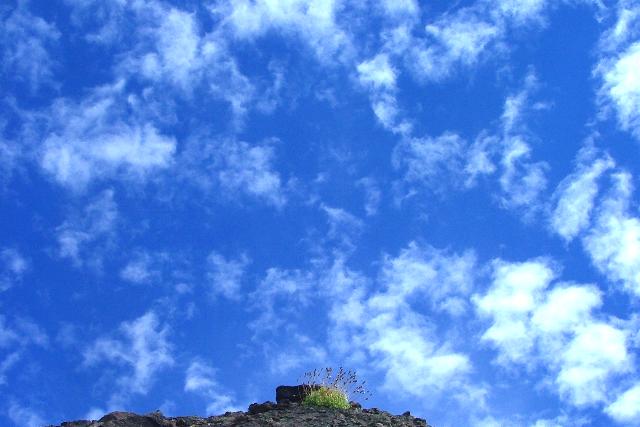
| the color on the sky is overdone, and it probably would even detract too much from the subject if it wasn't. |
|
| Photographer found comment helpful. |
|
|
04/30/2005 11:37:05 PM |
| wow, that sky is unbelievable. it somehow seems too large. great capture. |
|
| Photographer found comment helpful. |
|
|
04/30/2005 11:25:32 PM |
| sky looks very nice awesome pic |
|
| Photographer found comment helpful. |
|
|
04/30/2005 08:13:30 PM |
| Subject really needed to be stronger 5 |
|
| Photographer found comment helpful. |
|
|
04/30/2005 04:57:42 PM |
|
| Photographer found comment helpful. |
|
|
04/30/2005 02:56:39 PM |
| Such nice sky color. The plant would feel much more out of place is more of the barren land was shown. I understand going for minimal, but even another 1/8 in height of that corner being land would have helped. |
|
| Photographer found comment helpful. |
|
|
04/30/2005 11:50:57 AM |
|
| Photographer found comment helpful. |
|
|
04/30/2005 08:52:04 AM |
| Main subject is a little to little! :-) |
|
| Photographer found comment helpful. |
|
|
04/29/2005 01:35:13 PM |
| The sky dominates too much the picture IMO. Difficult to find the subject. 5 |
|
| Photographer found comment helpful. |
|
|
04/29/2005 05:37:48 AM |
| I think you've overdone the sky, the clouds are burnt out and I don't like the light blue color in them. Otherwise this idea is good, but I think that you should have taken this closer to the plants and then vertical, but leaving space above it as you do now. |
|
| Photographer found comment helpful. |
|
|
04/28/2005 04:51:48 PM |
| Just putting my sunglases on. Arr that`s better. Very blue :) |
|
| Photographer found comment helpful. |
|
|
04/27/2005 05:22:20 PM |
| You met the challenge. Not to sure about the artistic value of the photo. I like the sky as the background. Technical asspects are good. Focus, lighting ect. But I do not like the composition. |
|
| Photographer found comment helpful. |
|
|
04/27/2005 04:22:10 PM |
Awesome, just awesome.
However...
I think it would have been a bit more dramatic if the plant wasn't in the middle, but hey you edited it, not me. |
|
| Photographer found comment helpful. |
|
|
04/27/2005 11:58:56 AM |
| I would have carried the edge of the mound over to the left side - to secure it..... IMO it would feel better...still an interesting image. 6 |
|
| Photographer found comment helpful. |
Home -
Challenges -
Community -
League -
Photos -
Cameras -
Lenses -
Learn -
Help -
Terms of Use -
Privacy -
Top ^
DPChallenge, and website content and design, Copyright © 2001-2025 Challenging Technologies, LLC.
All digital photo copyrights belong to the photographers and may not be used without permission.
Current Server Time: 03/12/2025 08:13:28 AM EDT.