| Author | Thread |
|
|
06/21/2005 02:42:01 PM |
| I really like this shot, would like to see a bit more detail on the socket (being picky I guess). But very well done, love the title. |
|
 Photographer found comment helpful. Photographer found comment helpful. |
Comments Made During the Challenge  |
|
|
05/02/2005 11:15:24 PM |
| interesting - good framing |
|
| Photographer found comment helpful. |
|
|
05/02/2005 10:22:54 AM |
| This photo is very white and drawn out, i can barely see what the focus of the image is |
|
| Photographer found comment helpful. |
|
|
05/01/2005 09:02:58 AM |
| I like this very much. The composition and concept are great! |
|
| Photographer found comment helpful. |
|
|
04/30/2005 09:56:40 PM |
| cool use of this technique. |
|
| Photographer found comment helpful. |
|
|
04/30/2005 11:29:00 AM |
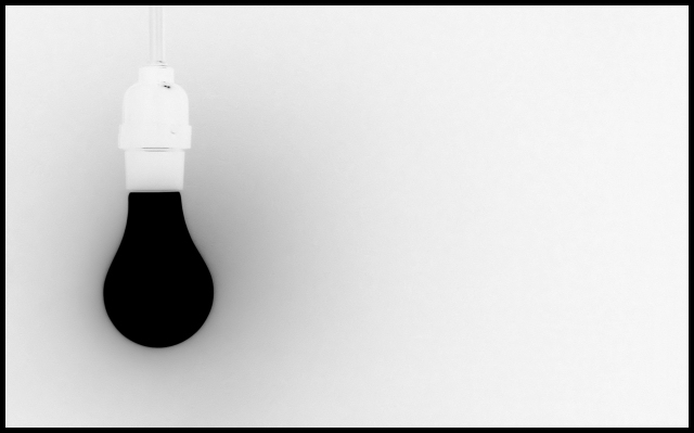
| I love this one because it is original,and nice to look at.A dark lightbulb,who would have thought of this ?! Very nice 8 |
|
| Photographer found comment helpful. |
|
|
04/29/2005 08:35:21 PM |
|
| Photographer found comment helpful. |
|
|
04/29/2005 08:00:37 PM |
| Some technical problems and as far as I'm concerned the photo meets the description of the challenge and the definition of Minimalism. I don't believe all art needs to be perfect in the execution. 10 |
|
| Photographer found comment helpful. |
|
|
04/29/2005 06:47:59 PM |
|
| Photographer found comment helpful. |
|
|
04/29/2005 04:59:21 PM |
| Cool idea, but I can see that you've inverted it. I have been wanting to try something like this, but in actuallity. Like getting the lighting so perfect, that certain spots are dark. Or a flashlight of darkness. Awsome shot though, way to be outside the box, inside the challenge. |
|
| Photographer found comment helpful. |
|
|
04/29/2005 02:13:38 PM |
| Good use of negitave space |
|
| Photographer found comment helpful. |
|
|
04/29/2005 01:14:08 PM |
| Nice simplicity, yet could be thought provoking at the same time. |
|
| Photographer found comment helpful. |
|
|
04/29/2005 11:39:50 AM |
| Wow,,awesome b&w,,I love,,,10 |
|
| Photographer found comment helpful. |
|
|
04/29/2005 02:32:46 AM |
| is it blurred on purpose? don't quite see why... good composition, though |
|
| Photographer found comment helpful. |
|
|
04/28/2005 07:38:16 PM |
|
| Photographer found comment helpful. |
|
|
04/28/2005 03:02:21 AM |
| Interesting photo perhaps as a sugestion the holder was to be faded out would make a striking image, Good work |
|
| Photographer found comment helpful. |
|
|
04/27/2005 11:20:57 PM |
|
| Photographer found comment helpful. |
|
|
04/27/2005 10:31:33 PM |
| A very good take on this challenge because the senses have to rearrange to accept the image. Bumping up. |
|
| Photographer found comment helpful. |
|
|
04/27/2005 06:13:50 PM |
| inverse colours, or shades, do make this photo more appealing, but because it's generally pretty dull and simple, nothing much can be done for it, 2 |
|
| Photographer found comment helpful. |
|
|
04/27/2005 03:53:55 PM |
| I saw a thread that said invert normally doesn't work, but I like it |
|
| Photographer found comment helpful. |
|
|
04/27/2005 11:40:46 AM |
| thats kinda cool, positioned well. |
|
| Photographer found comment helpful. |
|
|
04/27/2005 07:30:29 AM |
It shure is minimalism unlike my photo...I just wonted to participate for the first time
I think you will be the winer.... |
|
| Photographer found comment helpful. |
|
|
04/27/2005 02:28:02 AM |
| Very creative, the first I've seen like it in this exhibit so far. Nice job. |
|
| Photographer found comment helpful. |
Home -
Challenges -
Community -
League -
Photos -
Cameras -
Lenses -
Learn -
Help -
Terms of Use -
Privacy -
Top ^
DPChallenge, and website content and design, Copyright © 2001-2025 Challenging Technologies, LLC.
All digital photo copyrights belong to the photographers and may not be used without permission.
Current Server Time: 03/12/2025 03:35:03 PM EDT.