| Author | Thread |
|
|
04/16/2003 04:50:33 PM |
CC hello there Allen
Fits The Challenge-Yes
Composition-Okay
Background-Okay
My Opinion-That sunshine!! I can not knock sun, since I live in Oregon and we praise and worship sunshine here. 'overexposed' I see from the comments below [including mine]you've got the idea. Also it was mentioned that reducing the aperture/raising the shutter speed/or adjusting the white balance can help correct the harsh lighting. It's a little dance and you either have too little or too much. Just have to keep shooting/playing with you camera and shoot tons of pictures. Good effort, keep going keep coming up with your own unique ideas. This shot has great texture. |
|
Comments Made During the Challenge  |
|
|
04/13/2003 07:44:05 AM |
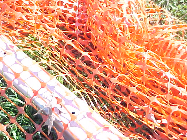
| This could be a potentially interesting shot. You have an interesting color contrast between the orange mesh, green grass, and white post. The critical problem is in the lighting. Because the light is so harsh, it is washing out the colors. I would suggest either using a polorizing filter or shooting with different light. |
|
|
|
04/13/2003 03:36:47 AM |
| The title "Warning" might have been more appropriate. You almost have a good texture thing happening, wich is being lost a bit in the brightness. |
|
|
|
04/12/2003 08:59:30 PM |
| nice color, too blinding, hope the print turned out better. |
|
|
|
04/11/2003 10:45:13 AM |
|
|
|
04/11/2003 01:13:34 AM |
| The color is entirely too washed out here. Too bright. Perhaps adjusting the contrast would have been a good idea. |
|
|
|
04/09/2003 11:44:29 AM |
|
|
|
04/09/2003 10:27:27 AM |
| really bright lighting sets off the orange, perhaps just a bit too bright, making it hard to focus your eyes on your subject. |
|
|
|
04/09/2003 10:25:53 AM |
|
|
|
04/09/2003 09:21:53 AM |
| A nice colorful image, maybe it might have had a lot more impact if you had increased the saturation levels a little, or adjusted the tonal curves. |
|
|
|
04/09/2003 12:59:00 AM |
| Clever shot. Wish it were polarized. It'd be even BETTER! |
|
|
|
04/08/2003 09:30:11 PM |
|
|
|
04/08/2003 10:10:58 AM |
| a little too bright. i think neither the orange and green are really allowed to add as much color punch to the photo as they could have - and more green could have been added by pulling back a bit or coming in and showing the green through the net in greater detail. |
|
|
|
04/08/2003 09:42:13 AM |
| A little overexposed - reducing the aperture or raising the shutter speed will help to make the colours more staurated. Composition is confused. |
|
|
|
04/08/2003 03:31:53 AM |
| Over saturated. Too much orange. It night look better with more of the green showing through. |
|
|
|
04/07/2003 10:29:44 PM |
| a litle too bright, need some post processing |
|
|
|
04/07/2003 01:02:44 PM |
| Somewhat over exposed but the right idea. |
|
|
|
04/07/2003 12:55:05 PM |
| good idea, the lighting is a bit much though |
|
Home -
Challenges -
Community -
League -
Photos -
Cameras -
Lenses -
Learn -
Help -
Terms of Use -
Privacy -
Top ^
DPChallenge, and website content and design, Copyright © 2001-2025 Challenging Technologies, LLC.
All digital photo copyrights belong to the photographers and may not be used without permission.
Current Server Time: 03/12/2025 02:17:33 PM EDT.