| Author | Thread |
|
|
05/04/2005 09:54:43 AM |
| I really think this should have placed higher...but then that's just me. Some of the comments are ridiculous and not very enlightened...what are people's problems with "clutter"...life is cluttered...I really loved this photo," clutter" and all...keep up the great work! |
|
Comments Made During the Challenge  |
|
|
05/03/2005 08:36:02 PM |
| A bit overexposed, but funny. I think that cropping this to remove everything left of the left curb would have reduced the clutter and improved the image. |
|
|
|
05/03/2005 08:27:10 AM |
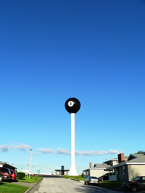
Very cool concept here. Yet the visual grounding is distracting due to the business of it. Perhaps go for a closer shot of the upper section of the water tower. That with the blue background would have been truely minimalist.
As it stands... Cool idea.. Just needs to be developed a bit further. |
|
|
|
05/02/2005 08:35:38 AM |
| I would have cropped out all of the ground and buildings. |
|
|
|
05/02/2005 03:29:59 AM |
| bottom of the photo is too cluttered, and the sky above the ball has no function. |
|
|
|
05/01/2005 04:54:31 PM |
| this shot don't tell me more |
|
|
|
05/01/2005 03:41:04 PM |
| I don't know what it is about this picture but I love it...for some reason it has a really cool, hep, mid century feel to it in my biased opinion ( I love all things that smack of mid-centuryishness)...maybe it's the 8 ball? Nice, clean, simple. |
|
|
|
05/01/2005 03:10:49 PM |
| imo there is an excessive use of neat image here. |
|
|
|
04/30/2005 09:43:04 PM |
| Cool. Could do without the neighborhood, very distracting. Perhaps a shot taken at the base of the tower with the 8 in a lower corner with a plane or clouds going by? |
|
|
|
04/30/2005 08:20:05 PM |
Wow man, either it's real or... I just don't know
It's just simply cool, I wish that were over my house |
|
|
|
04/30/2005 07:31:14 PM |
| Strange picture. Something to it. I really like the colors, but I suspect it could be better composed. |
|
|
|
04/30/2005 07:15:42 PM |
| If your going to have a water tower?, you might as well make it interesting. I think taking out all the houses and just having the tower with the blue background of the sky would have been more powerful. 5 |
|
|
|
04/30/2005 12:41:32 PM |
| snapshot, but it IS interesting, composition wise and, i like the colour of the sky, so not 1, but 3, because it is a little more than a snapshot. |
|
|
|
04/30/2005 11:47:32 AM |
|
|
|
04/30/2005 01:45:59 AM |
| good choice of subject, but found the foreground elements distracting |
|
|
|
04/29/2005 11:18:35 AM |
|
|
|
04/29/2005 07:38:18 AM |
| Nice find! I think I would have tried to get only the ball and sky and clouds in the frame... The street cars and houses spoil it a bit for me |
|
|
|
04/29/2005 06:49:52 AM |
| thats pretty unusual, i think this would have been better if you could have blocked out all the other distractions, but i can plainly see that the 8 ball is the subject so i'll give you an 8 for quality and coolness |
|
|
|
04/28/2005 09:52:40 PM |
| Nice deep blue sky. Highlight almost blown out at the horizon. |
|
|
|
04/28/2005 09:05:35 PM |
| Wow what town has a giant eight ball on a pedestal. I hope that is a billiard hall. Nice layout with the street and everything. |
|
|
|
04/28/2005 08:06:17 PM |
| I think that a crop that would crop of below the clouds would really improve this shot. |
|
|
|
04/28/2005 07:03:14 PM |
| this is a cool shot of what i believe is a very cool water tower....however imo it just doesnt seem to be minamilistic with all the other things going on |
|
|
|
04/28/2005 01:22:18 PM |
|
|
|
04/28/2005 01:17:30 PM |
| Must be nice living that close to a pool hall. I think I would have liked it more in a minimal fashion if it was cropped so it looked like a 8 ball on a tee. Just my option, for what it is worth. Hope it does well for you |
|
|
|
04/28/2005 12:25:13 PM |
| Great photograph. Slightly mad, love the composition, especially the relative positioning of those cars; and the tonal range throughout - even the blown post. Nice shooting indeed. |
|
|
|
04/27/2005 02:44:27 PM |
| Interesting shot. A bit light. I can't imagine living next door to THAT! |
|
|
|
04/27/2005 12:58:56 PM |
| That's a great subject and a great title! The sky is beautiful and the photo is crisp. I think the photo would have been a lot stronger if the road and houses were not included. I think it would look fine cropped this way. I do find the line of clouds interesting, and I think maybe getting a bit closer might have moved the houses out of the photo and the clouds could have been included. Finally, you might consider moving the subject nearer the corner of the photo. About eight or nine times out of ten the subject is better off-center. (Hope you forgive me if you already know all this.) |
|
|
|
04/27/2005 09:45:32 AM |
| Can't say I'd want that as my next door neighbor. |
|
|
|
04/27/2005 09:40:22 AM |
| if all that clutter at the bottom had been cropped and just the sky and pole and ball then I would have voted it a 10...too much distracting at the bottom to be minimalism |
|
|
|
04/27/2005 06:34:40 AM |
| Now if you had cropped off all the street or taken it with the ball, cue and clouds - that would have been something. As it is I find it too 'fussy' |
|
|
|
04/27/2005 04:48:52 AM |
| maybe would have been better offcentre |
|
Home -
Challenges -
Community -
League -
Photos -
Cameras -
Lenses -
Learn -
Help -
Terms of Use -
Privacy -
Top ^
DPChallenge, and website content and design, Copyright © 2001-2025 Challenging Technologies, LLC.
All digital photo copyrights belong to the photographers and may not be used without permission.
Current Server Time: 03/14/2025 03:46:34 AM EDT.