| Author | Thread |
|
|
05/04/2005 01:30:56 AM |
You bastards on the Oregon coast! "first competition, please be nice..." PHOOEY! If I had scenery year round like y'all do, I'd be doing much better! Grrr! 'Pierre Morte,' eh? How's about 'Perry Mort,' punk?
Edited to add "Phooey"
Message edited by author 2005-05-04 01:32:38. |
|
 Photographer found comment helpful. Photographer found comment helpful. |
Comments Made During the Challenge  |
|
|
05/03/2005 10:54:37 PM |
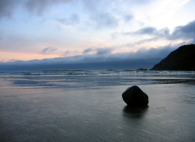
| That rock looks awfully alone. Would have liked a touch more light on it, but a really strong composition. |
|
| Photographer found comment helpful. |
|
|
05/03/2005 06:05:42 PM |
|
| Photographer found comment helpful. |
|
|
05/03/2005 09:33:26 AM |
|
| Photographer found comment helpful. |
|
|
05/02/2005 11:59:08 PM |
| great colors and feeling for stillness |
|
| Photographer found comment helpful. |
|
|
05/02/2005 10:28:50 AM |
| Wow..this is a nice shot. I love the water and the sky..it was a neat idea for the objective. Very nice shot! The lighting is great! |
|
| Photographer found comment helpful. |
|
|
05/01/2005 02:21:24 PM |
| oh wow. this is simply amazing! adding to my favourites! 10 |
|
| Photographer found comment helpful. |
|
|
05/01/2005 03:11:23 AM |
| You really should have used a smaller aperture on this one.. the rock is sharp and nice but the horizon is all blurry. maybe you did that to preserve focus on your primary subject... but IMO, it might have worked better with a greater DOF.. 6. |
|
| Photographer found comment helpful. |
|
|
04/30/2005 08:22:56 PM |
Wow, very emotive image
I really like this one, everything looks perfect to me- no where to improve with this particular image in my oppinion with the available editing options |
|
| Photographer found comment helpful. |
|
|
04/30/2005 07:00:47 PM |
| This image is very pleasing to me. I like the colors, and the clouds. 8 |
|
| Photographer found comment helpful. |
|
|
04/30/2005 01:28:24 PM |
| This picture is pretty, but it is hard to make out the minimal object..a little dark. |
|
| Photographer found comment helpful. |
|
|
04/30/2005 12:44:15 PM |
|
| Photographer found comment helpful. |
|
|
04/30/2005 06:56:04 AM |
| Pretty good. Nice execution, nice colors, but for me, it would be 100 times better without the mountain in the background, even at the expense of the cool cloud over it. 6 |
|
| Photographer found comment helpful. |
|
|
04/30/2005 05:30:16 AM |
| I like the silhouette of the rock (I assume it is a rock). The sky and sunset colors also add to the photo. 7 |
|
| Photographer found comment helpful. |
|
|
04/29/2005 11:52:07 PM |
the sinple smoothness on the solitare rock makes it work in this challenge.
To make it a spectacular picture i would have liked to see a bit more DOF or a bit less so the mountains were in focus as well. |
|
| Photographer found comment helpful. |
|
|
04/29/2005 11:02:44 PM |
| I think my favorite thing about this shot is the movement of the water....such a graceful texture. I think that perhaps the rock could stand out a bit more clearly. But a lovely shot nonetheless. |
|
| Photographer found comment helpful. |
|
|
04/29/2005 10:39:33 PM |
| very nice mood feel to this image 7 |
|
| Photographer found comment helpful. |
|
|
04/29/2005 06:06:07 PM |
| Nice capture. A different angle may have helped make the object smaller. |
|
| Photographer found comment helpful. |
|
|
04/29/2005 03:20:27 PM |
| I like this image, however I wish you had take this shot more from the right and out towards the ocean to eliminate the mountain/hill on the righ hand side. Find it distracting and negatively impacting the result. Good Luck. |
|
| Photographer found comment helpful. |
|
|
04/29/2005 02:11:48 PM |
| Bravo! Simple. Fading glory. Well worn timeless stone. I love the leading lines quietly found in the sand, inviting the eye to the last lights of this dying day. My only crit is catching this stone in silhouette causes the ocean worn texture and shape to be lost. Hope this scores well! |
|
| Photographer found comment helpful. |
|
|
04/29/2005 12:34:49 PM |
| Neat landscape shot. The rock in the foreground really strengthens the composition for me and the colors are very nice. |
|
| Photographer found comment helpful. |
|
|
04/29/2005 12:05:19 PM |
| simple, lovely colours, really nice....a 10 |
|
| Photographer found comment helpful. |
|
|
04/28/2005 01:41:07 PM |
| Very nice. I wish you could spot edit this one. Bring out more of the colors |
|
| Photographer found comment helpful. |
|
|
04/28/2005 12:53:42 PM |
| Pretty image, i think you made it fit the challenge well |
|
| Photographer found comment helpful. |
|
|
04/28/2005 10:16:10 AM |
| Maybe some fill flash would've given some small detail in the rock? |
|
| Photographer found comment helpful. |
|
|
04/28/2005 03:27:37 AM |
| Looks like a place i like to call Indian Beach (and close to my heart!) |
|
| Photographer found comment helpful. |
|
|
04/27/2005 06:38:03 PM |
| 9 both because it meets the challenge and it's a dang good shot!! |
|
| Photographer found comment helpful. |
|
|
04/27/2005 02:22:21 PM |
| Great composition. I think using the hyperfocal to provide depth of field throughout the frame would've made this a little better though. As it is the horizon is just a little too blurry for me. |
|
| Photographer found comment helpful. |
|
|
04/27/2005 11:52:42 AM |
| very nice...the main drawback for me is the point/hill in right background |
|
| Photographer found comment helpful. |
|
|
04/27/2005 01:33:53 AM |
| Awsome shot! To bad the sunset didn't get more colorful. But of course that would make your main subject stand out less, so I guess the way it is now is good =). I know you coudn't really change this either, but the mark to the right of the rock it a tad annoying. Great composition on this shot, with the rock in the lower left rule of third, the horizon in the center, and the land mass leading down into the rock. Overall: great job! Where did you get the title? |
|
| Photographer found comment helpful. |
Home -
Challenges -
Community -
League -
Photos -
Cameras -
Lenses -
Learn -
Help -
Terms of Use -
Privacy -
Top ^
DPChallenge, and website content and design, Copyright © 2001-2025 Challenging Technologies, LLC.
All digital photo copyrights belong to the photographers and may not be used without permission.
Current Server Time: 12/14/2025 02:04:49 PM EST.