| Author | Thread |
Comments Made During the Challenge  |
|
|
04/13/2003 11:01:40 PM |
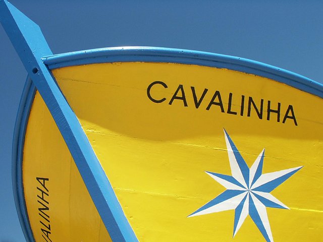
| So simple and yet so excellent. One of my top five this week! Great colors and eye. Too bad they didn't paint it one shade of blue darker, I think it would have disappeared into that sky!! |
|
|
|
04/13/2003 12:04:55 AM |
| I love the subject and colors in this photo, and the way the sky looks as a background. Everything is great, except I don't like your composition. I don't know exactly what I would have done differently, but I know I would have done it differently. |
|
|
|
04/12/2003 09:12:41 PM |
|
|
|
04/12/2003 04:06:05 PM |
| now we're talking!! finally a submission that is clear, crisp, composed well, interesting, has spunk! bravo! |
|
|
|
04/12/2003 12:58:33 PM |
| Such a subtle difference in the blue of the sky and the blue in the boat. I like that. Too bad about the noise in the sky (could be just my computer). Colors are vivid and it's well focused. Good job! |
|
|
|
04/12/2003 02:01:30 AM |
| Good work. The two tone colours are just great and well composed. Good luck |
|
|
|
04/11/2003 05:00:06 PM |
| Nice, bright colors and good contrast. NIce shot. |
|
|
|
04/11/2003 12:06:11 PM |
| Perfect angle! Why did you cut the tip off? There are two noticeable crop points I don't like - one is the tip of the boat, the other is the bottom tip of the star. The colors are superb - I like how the boat and the sky are both beautiful shades of blue. |
|
|
|
04/11/2003 02:30:40 AM |
| I really love the pastel colors and bold composition in this piece. Very nicely done! 10 (Best in challenge in my opinion... I hope you do well!) |
|
|
|
04/10/2003 08:11:19 PM |
| good perspective on this. At first I thought I wanted the shadow on the right gone, but decided upon looking again that it adds dimension to the boat. Makes it seem a whole lot bigger than the viewer! On composition, I would have liked to catch the bottom of the star, but that's a minor point. (no pun intended!) |
|
|
|
04/09/2003 12:38:34 PM |
| great shot... the blue and yellow work very well together... the composition is also very strong... nice work :) - setzler |
|
|
|
04/09/2003 11:22:56 AM |
|
|
|
04/09/2003 10:30:16 AM |
| LOVE the colors. The angle is great! |
|
|
|
04/09/2003 10:14:53 AM |
|
|
|
04/09/2003 06:09:33 AM |
| Beautiful colours. nice framing. (8) |
|
|
|
04/08/2003 10:17:08 PM |
| Very nice color, this truly is about color. (10) |
|
|
|
04/08/2003 08:09:59 PM |
| Very, very nice. Simple and beautiful. |
|
|
|
04/08/2003 02:22:28 PM |
| nice , though the amputations of the tip of the star and boat name are distracting from a really strong, bold composition. I like it. |
|
|
|
04/08/2003 09:42:35 AM |
|
|
|
04/08/2003 06:20:59 AM |
| Nice composition (though I'd give the boat's bow a little more space) and great colour contrast. |
|
|
|
04/08/2003 06:08:02 AM |
| Nice vivid colors here. The yellow and blue and the title remind me very much of Brasil. I particularly like the crop you have chosen here, the blue sky matches in perfectly to the blue of the boat - 9. |
|
|
|
04/07/2003 07:45:03 PM |
| Nice!!!! The sky almost matches the blue on the boat which gives a really nice appeal to this shot! 8. |
|
|
|
04/07/2003 10:49:46 AM |
| Pretty -sunshine yellow and sky blue. |
|
|
|
04/07/2003 06:46:51 AM |
| This is more like it! Bright, vivid colours - the best I've seen so far. The blues are almost exactly matched too - very nice shot 8. |
|
Home -
Challenges -
Community -
League -
Photos -
Cameras -
Lenses -
Learn -
Help -
Terms of Use -
Privacy -
Top ^
DPChallenge, and website content and design, Copyright © 2001-2025 Challenging Technologies, LLC.
All digital photo copyrights belong to the photographers and may not be used without permission.
Current Server Time: 03/12/2025 09:03:55 PM EDT.