| Author | Thread |
Comments Made During the Challenge  |
|
|
04/12/2003 12:33:27 PM |
| Good shot for this category. |
|
 Photographer found comment helpful. Photographer found comment helpful. |
|
|
04/11/2003 12:46:44 AM |
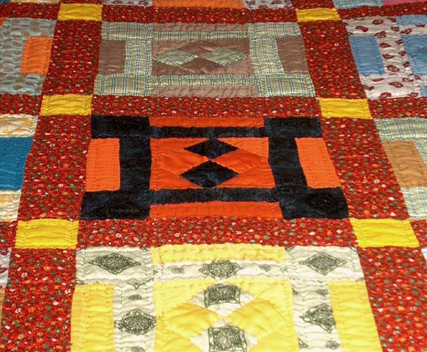
| patchwork quilt. I wish I had one. very nice.... |
|
| Photographer found comment helpful. |
|
|
04/10/2003 08:05:30 AM |
| Ah colorful! This is a different way to present color, good idea! |
|
| Photographer found comment helpful. |
|
|
04/09/2003 11:24:30 PM |
| I think I would have preffered a longer shot and more even lighting. |
|
| Photographer found comment helpful. |
|
|
04/09/2003 02:45:47 AM |
| Nice Quilt. I'm not sure this is the best angle. |
|
| Photographer found comment helpful. |
|
|
04/08/2003 09:43:11 PM |
|
| Photographer found comment helpful. |
|
|
04/08/2003 10:16:04 AM |
| i think these are actually quite challenging pictures to take because its hard to give the photo a professional look versus just a snapshot. i think the symmetry actually hurts the photo, and maybe choosing a lower angle would have given some more depth of field and made the photo more interesting (and i always love increased saturation to bring the colors out). |
|
| Photographer found comment helpful. |
|
|
04/08/2003 05:27:28 AM |
| Lot of work here by Mom. lot's of color, good lighting in photographing it, good focus too. Not a really great shot, just a shot of Mom's work to say. Visual impact is okay, when you cropped it, nothing was cropped too evenly, see what I mean? making it, just a picture, not to really stand out. |
|
| Photographer found comment helpful. |
|
|
04/07/2003 09:32:24 PM |
You made a nice use of color here but I think the picture could be more exciting. I think the lighting is what is getting you here as well as to a lesser degree the composition. I don�t know if this is possible with the equipment that you have but I think the perspective could be better. You might try this one with a longer focal length so the lines are a little closer to parallel. To me it detracts for the picture that the center row of squares isn�t exactly centered. If you had really offset it then it wouldn�t be an issue, but it is so close to being centered that for me it really needs to be centered. The other issue is the lighting. This, for me, is the more critical issue with this picture. The lighting looks a bit harsh and unnatural. I am guessing you used the on-camera flash in conjunction with the ambient room lighting. I think what would really help this picture would be to place some tissue-paper over the light sources to diffuse the light. I would also boost the saturation and contrast to make the colors richer. Keep working on it, I think you have a good start here. I gave it a 4.
Greg
|
|
| Photographer found comment helpful. |
|
|
04/07/2003 01:11:21 PM |
| You have too like them... |
|
| Photographer found comment helpful. |
|
|
04/07/2003 12:42:48 PM |
| A lotta love in this quilt and you've captured it well |
|
| Photographer found comment helpful. |
|
|
04/07/2003 10:40:19 AM |
|
| Photographer found comment helpful. |
Home -
Challenges -
Community -
League -
Photos -
Cameras -
Lenses -
Learn -
Help -
Terms of Use -
Privacy -
Top ^
DPChallenge, and website content and design, Copyright © 2001-2025 Challenging Technologies, LLC.
All digital photo copyrights belong to the photographers and may not be used without permission.
Current Server Time: 03/12/2025 12:07:46 PM EDT.