| Author | Thread |
Comments Made During the Challenge  |
|
|
04/13/2003 04:42:15 PM |
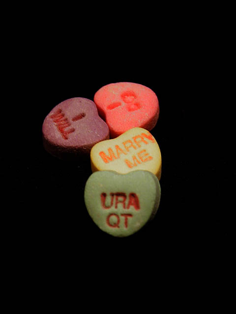
| Needs a sharper focus and a different crop. Especially the "ura qt" being somewhat blurry creates problems for the shot. Also the empty space at the top, bottom, and right side don't seem to serve a function, so a tighter crop would probably be prefered if you wanted to leave your subject centered. I like the "path" idea that you used, but this needs a little cleaner execution. |
|
 Photographer found comment helpful. Photographer found comment helpful. |
|
|
04/12/2003 10:23:24 PM |
| Even thought it is not in color, I like the jet black background for this image. The hearts are not quite as "colorful" as I would like for this Challenge but the arrangement is great. I would prefer the closest heart to be in better focus. |
|
| Photographer found comment helpful. |
|
|
04/12/2003 07:21:03 PM |
| If you still have these candies in April, please throw them out! Blech! :) |
|
| Photographer found comment helpful. |
|
|
04/12/2003 01:13:11 PM |
| Not enough here. Very dark and bland. |
|
| Photographer found comment helpful. |
|
|
04/12/2003 12:34:49 PM |
|
| Photographer found comment helpful. |
|
|
04/12/2003 09:15:29 AM |
| cute idea. needs better focus. having it centered with so much black around it is not a great impact. I think it would be more interesting off toward the lower left cormer,. or right. |
|
| Photographer found comment helpful. |
|
|
04/11/2003 01:38:11 PM |
|
| Photographer found comment helpful. |
|
|
04/11/2003 12:48:02 AM |
| nice message. maybe the black background changed the colors of the hearts. |
|
| Photographer found comment helpful. |
|
|
04/09/2003 10:23:26 PM |
| Should've did this one for candy instead of color. I'm sure you've heard that a million times. Not wild about the idea. Photo is pretty good though. |
|
| Photographer found comment helpful. |
|
|
04/09/2003 09:43:49 AM |
| You have a nice composition, but the clor does not pop. I think you needed a little more light to brighten it up. 5 |
|
| Photographer found comment helpful. |
|
|
04/09/2003 09:12:05 AM |
| Simple but colorful. Personally I would have tightened the crop a little, or maybe gotten it squarer. |
|
| Photographer found comment helpful. |
|
|
04/08/2003 06:24:02 PM |
| kind of blurry, but nice idea |
|
| Photographer found comment helpful. |
|
|
04/08/2003 02:07:46 AM |
| I like to solid background. The front is a little out of focus. Some of the letters hurt my eye though. Maybe it's me. |
|
| Photographer found comment helpful. |
|
|
04/07/2003 11:45:41 PM |
| Interesting approach to the subject; I like the very dark background in contrast to the brighter colors. In my opinion, I think the green candy heart should also have been in sharper focus. Quite nicely done! |
|
| Photographer found comment helpful. |
|
|
04/07/2003 01:02:23 PM |
|
| Photographer found comment helpful. |
|
|
04/07/2003 10:25:55 AM |
|
| Photographer found comment helpful. |
Home -
Challenges -
Community -
League -
Photos -
Cameras -
Lenses -
Learn -
Help -
Terms of Use -
Privacy -
Top ^
DPChallenge, and website content and design, Copyright © 2001-2025 Challenging Technologies, LLC.
All digital photo copyrights belong to the photographers and may not be used without permission.
Current Server Time: 03/12/2025 08:07:56 PM EDT.