| Author | Thread |
Comments Made During the Challenge  |
|
|
04/13/2003 02:28:57 PM |
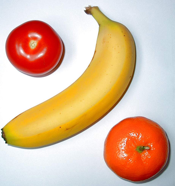
| Would increase margin to left of the banana by two mm :-). |
|
 Photographer found comment helpful. Photographer found comment helpful. |
|
|
04/12/2003 07:50:37 PM |
| Simple but effective, good one! |
|
|
|
04/12/2003 06:50:56 PM |
| Percent sign -- clever! Wonder how many people will get it? |
|
| Photographer found comment helpful. |
|
|
04/11/2003 11:50:56 AM |
| Interesting take on the challenge. Good idea |
|
| Photographer found comment helpful. |
|
|
04/11/2003 12:46:13 AM |
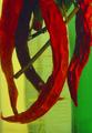
| nice. I think the shadows are a little too hard. I like the separation of colors |
|
| Photographer found comment helpful. |
|
|
04/09/2003 04:14:08 PM |
| Took me a 2nd glance to realize the "%" symbol. Clever. |
|
| Photographer found comment helpful. |
|
|
04/09/2003 11:17:56 AM |
|
| Photographer found comment helpful. |
|
|
04/09/2003 10:24:58 AM |
|
|
|
04/08/2003 10:59:37 PM |
| good choice of fruice and veggies, good lighting, focus is right on; good cropping, great idea for the challenge |
|
| Photographer found comment helpful. |
|
|
04/08/2003 10:14:22 PM |
| The shadows really pull away from this image |
|
| Photographer found comment helpful. |
|
|
04/08/2003 06:17:24 PM |
| kind of blurry, but nice idea |
|
|
|
04/08/2003 12:35:18 PM |
| VERY bright lighting, but great colors. Looks saturated or color changed towards red, though. |
|
| Photographer found comment helpful. |
|
|
04/07/2003 11:39:06 PM |
| Are you certain that shouldn't be color? Without the "u" :-) Seriously, now... I'm not certain whether it is simply the lighting, or what, but this shot seems a bit too two-dimensional to me. The fruit just doesnt't seem to 'pop' out of the photo. Perhaps a softer (maybe fluorescent, no flash) lighting might help you capture some additional depth and dimension, while also eliminating the individual shadows. |
|
| Photographer found comment helpful. |
|
|
04/07/2003 10:09:40 PM |
| I would have liked some brown spots on the bananna. |
|
|
|
04/07/2003 06:29:41 PM |
|
| Photographer found comment helpful. |
|
|
04/07/2003 02:43:30 PM |
| Cute title. THe light is harsh and caused too much glare. Other then that, fine job. |
|
| Photographer found comment helpful. |
|
|
04/07/2003 02:00:15 PM |
| Simple and colorful. Like the diagonal here |
|
| Photographer found comment helpful. |
Home -
Challenges -
Community -
League -
Photos -
Cameras -
Lenses -
Learn -
Help -
Terms of Use -
Privacy -
Top ^
DPChallenge, and website content and design, Copyright © 2001-2025 Challenging Technologies, LLC.
All digital photo copyrights belong to the photographers and may not be used without permission.
Current Server Time: 03/12/2025 07:49:06 AM EDT.