| Author | Thread |
Comments Made During the Challenge  |
|
|
05/14/2005 08:35:21 PM |
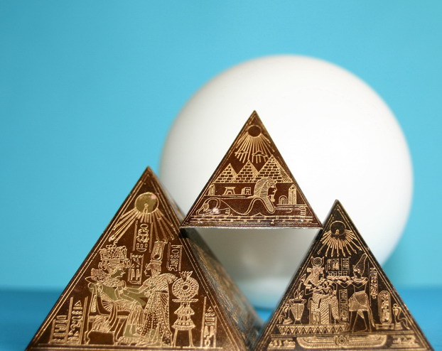
| If you had gotton the pyramids to be straight across the frame I would haven given you a very top score (so far) because I the emphasis you brought onto the shapes with the use of light and color. not overdone_just right |
|
 Photographer found comment helpful. Photographer found comment helpful. |
|
|
05/12/2005 05:10:35 PM |
|
| Photographer found comment helpful. |
|
|
05/12/2005 04:02:37 PM |
| Shape is distracted by the specific drawings. Backdrop does not add. |
|
| Photographer found comment helpful. |
|
|
05/12/2005 03:15:06 PM |
|
| Photographer found comment helpful. |
|
|
05/12/2005 10:41:03 AM |
|
| Photographer found comment helpful. |
|
|
05/11/2005 06:57:09 PM |
| interesting, looks a little out of tocus in the center |
|
| Photographer found comment helpful. |
|
|
05/11/2005 05:13:41 PM |
|
| Photographer found comment helpful. |
|
|
05/11/2005 12:02:50 PM |
| nice work, like how you use the ball as some part background |
|
| Photographer found comment helpful. |
|
|
05/11/2005 11:40:48 AM |
| Very elegant composition. The only criticism: the inside face of the left pyramid is a little distracting. 8 |
|
| Photographer found comment helpful. |
|
|
05/11/2005 06:03:10 AM |
the white ball in the background is unnecessary and distracting. altogether, i think this would work much better if you take away everything but the pyramids, put some space below them as well (more balance) and just a solid background.
nice idea, composition needs work. |
|
| Photographer found comment helpful. |
|
|
05/11/2005 02:50:28 AM |
|
| Photographer found comment helpful. |
Home -
Challenges -
Community -
League -
Photos -
Cameras -
Lenses -
Learn -
Help -
Terms of Use -
Privacy -
Top ^
DPChallenge, and website content and design, Copyright © 2001-2025 Challenging Technologies, LLC.
All digital photo copyrights belong to the photographers and may not be used without permission.
Current Server Time: 03/12/2025 01:54:45 AM EDT.