| Author | Thread |
Comments Made During the Challenge  |
|
|
05/17/2005 09:42:50 PM |
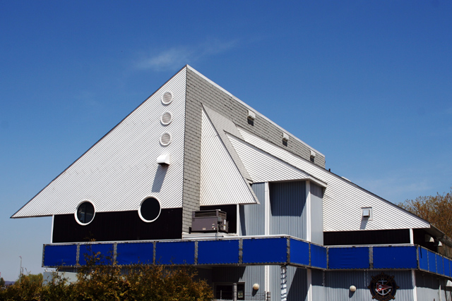
| The blue on blue really works. The tight cropping emphasizes the triangles. 7. |
|
 Photographer found comment helpful. Photographer found comment helpful. |
|
|
05/17/2005 07:11:58 PM |
| nice. No moire and great exposure. Excellent job on a technically difficult shot! |
|
| Photographer found comment helpful. |
|
|
05/17/2005 10:58:59 AM |
4 triangles,
18 rectangles,
4 shades of blue,
1 uglyass house. :) |
|
| Photographer found comment helpful. |
|
|
05/17/2005 10:20:14 AM |
| the first thing my eyes see here is what i think is an A/C unit. I would have tried to get a composition/angle of the left triangle only. |
|
| Photographer found comment helpful. |
|
|
05/17/2005 08:19:56 AM |
| Nice, but without bottom it loses some life. |
|
| Photographer found comment helpful. |
|
|
05/16/2005 09:36:37 PM |
| Composition is nice, but I feel like it wants some contrasting colors or something to liven it up. |
|
| Photographer found comment helpful. |
|
|
05/13/2005 07:53:51 AM |
| Too many. Focus on one to draw attention. |
|
| Photographer found comment helpful. |
|
|
05/11/2005 06:14:27 PM |
| Good eye seeing this! Strange architecture. Thanks for sharing! |
|
| Photographer found comment helpful. |
|
|
05/11/2005 08:03:07 AM |
| I think I would have cropped this right above the blue. |
|
| Photographer found comment helpful. |
Home -
Challenges -
Community -
League -
Photos -
Cameras -
Lenses -
Learn -
Help -
Terms of Use -
Privacy -
Top ^
DPChallenge, and website content and design, Copyright © 2001-2025 Challenging Technologies, LLC.
All digital photo copyrights belong to the photographers and may not be used without permission.
Current Server Time: 03/12/2025 08:26:54 PM EDT.