| Author | Thread |
Comments Made During the Challenge  |
|
|
05/17/2005 09:57:48 AM |
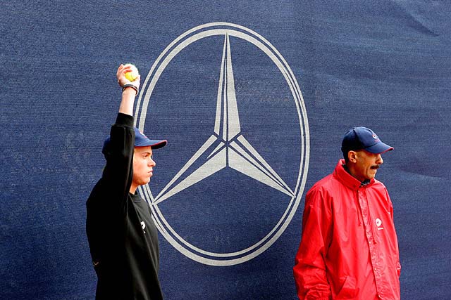
| A little too centered (lots of extra space left and right) A tighter image might have "popped" the logo better. I look at the boy (from title) and the man (from bright garb) and then, the triangle(s). 7 |
|
 Photographer found comment helpful. Photographer found comment helpful. |
|
|
05/16/2005 05:36:50 PM |
| Odd. Might have been better in black & white, for a Cartier-Bresson kind of feel. But I like it. |
|
| Photographer found comment helpful. |
|
|
05/11/2005 04:47:12 PM |
| Well seen especially with the primary colors and black and white. It's a little bit static though and I don't know why. Perhaps because its too centered. Good job anyway in seeing this triangle. |
|
| Photographer found comment helpful. |
|
|
05/11/2005 10:51:43 AM |
| the people do not seem to be to clear |
|
|
|
05/11/2005 10:45:02 AM |
| coooool....which tournament was this? |
|
| Photographer found comment helpful. |
Home -
Challenges -
Community -
League -
Photos -
Cameras -
Lenses -
Learn -
Help -
Terms of Use -
Privacy -
Top ^
DPChallenge, and website content and design, Copyright © 2001-2025 Challenging Technologies, LLC.
All digital photo copyrights belong to the photographers and may not be used without permission.
Current Server Time: 03/12/2025 08:36:50 PM EDT.