| Author | Thread |
|
|
05/28/2005 04:24:04 AM |
| No, unfortunetly his name is not Tim. Else if it was, then it would of been a joke on everyone involved. Thanks Minstrel. |
|
|
|
05/27/2005 09:21:27 PM |
my name is Tim. I just wanted you to know that I liked your title : Contimplation better than Contemplation.
is your son's name Tim?
I'm sorry to hear about his depression. |
|
 Photographer found comment helpful. Photographer found comment helpful. |
|
|
05/26/2005 11:26:09 PM |
| i dont think many people marked you down for the spelling error, your scores still show a symmetrical bell-shaped curve. |
|
| Photographer found comment helpful. |
|
|
05/25/2005 08:46:06 AM |
Soulful shot. Best of luck for your son, there is always hope. My heart goes out to him for so many reasons. |
|
| Photographer found comment helpful. |
|
|
05/25/2005 03:26:29 AM |
| Okay so you complained about all the spelling comments, but people really left you some good advice on your photo technique. I would read through these agian. |
|
| Photographer found comment helpful. |
Comments Made During the Challenge  |
|
|
05/24/2005 04:55:20 PM |
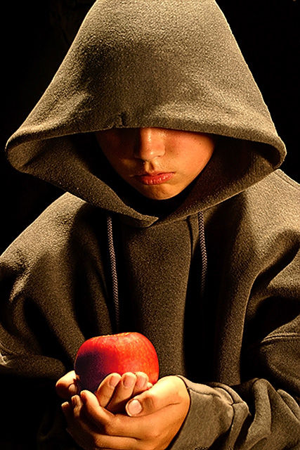
| Don't eat it!!!! Puts me in mind of "Snow White" :P A nifty shot, and the colours really compliment one another (I'm guessing hue/saturation adjustments?). My only beef is it looks really staged. |
|
| Photographer found comment helpful. |
|
|
05/24/2005 09:23:30 AM |
| This is a nice image. I really like the shadow and thought that are seen in this photograph. |
|
| Photographer found comment helpful. |
|
|
05/24/2005 08:44:29 AM |
| That would be conTEMplation. |
|
|
|
05/24/2005 02:31:30 AM |
Your title is spelled wrong. That may sound like I am picking, but I just think you should do a spell check before submitting ;)
I did not mark you down for that thoug. I did however because the apple is soft and his face is sharp. Since the apple is the subject I would have liked to see that the other way. Also to me it is unimaginative to have a person holding an apple. Not bad for a photo to me just average. |
|
|
|
05/23/2005 07:49:40 PM |
| the lighting really contrasts with the mood of the rest of this piece. low key lighting would have been much more appropriate. |
|
|
|
05/22/2005 09:23:15 PM |
|
|
|
05/20/2005 02:59:04 PM |
| This is beautiful! The contrast in colours and the positioning of thr hands is great. So sharp. 9 |
|
|
|
05/19/2005 10:40:32 AM |
| I like the thought that went into this shot. The pose and mood through light placement is good. There is a yellow cast over this entire image. This can be corrected and the true colors brought out if you would take a moment to white balance your camera to the lighting conditions of the scene prior to taking the picture. A left border crop to eliminate the light colored fold just to the left of the apple would be my choice as well. |
|
| Photographer found comment helpful. |
|
|
05/18/2005 09:26:33 PM |
| contemplation? Nice use of lighting. |
|
|
|
05/18/2005 04:47:59 PM |
| Nice shot. Looks a tiny bit grainy or oversharpened. |
|
|
|
05/18/2005 02:13:47 PM |
| Nice idea, but sidelighting would make this more effective imho. Change the i with an e and you're all set. ;-) |
|
|
|
05/18/2005 10:59:42 AM |
| The light from above looks artificial, particularly given the almost medieval theme. Also, the word is spelled "contemplation". |
|
|
|
05/18/2005 09:30:29 AM |
| Cont-e-mplation, nice lighting. |
|
Home -
Challenges -
Community -
League -
Photos -
Cameras -
Lenses -
Learn -
Help -
Terms of Use -
Privacy -
Top ^
DPChallenge, and website content and design, Copyright © 2001-2025 Challenging Technologies, LLC.
All digital photo copyrights belong to the photographers and may not be used without permission.
Current Server Time: 03/12/2025 02:55:36 PM EDT.