| Author | Thread |
Comments Made During the Challenge  |
|
|
05/19/2005 12:10:27 AM |
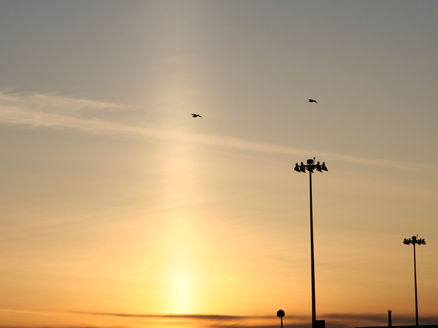
| For me personally, a tighter crop might have been more effective. There is too much space in the lower left, but not enough to be truly effective negative space, I think. |
|
 Photographer found comment helpful. Photographer found comment helpful. |
|
|
05/17/2005 01:27:10 PM |
| Great silhoutte work but it lacks an interesting enough subject to be one of the top contenders IMO. The silhoutte's are good and crisp and the sunset has very pleasant colors. Better than most but not quite ribbon material. |
|
| Photographer found comment helpful. |
|
|
05/17/2005 09:01:45 AM |
| The 'top-bottom' feel of this scene is lost a bit because of the square format. 4 |
|
| Photographer found comment helpful. |
|
|
05/16/2005 02:39:29 PM |
Do you reallize this is an unusual weather effect called a sun pillar? It requires a certain shape of ice crystals in the atmosphere to reflect the light, right amount, right altitudes, right time... I've noticed that a few sunset shots in this challenge have them to varying degrees. Amazing that this was occuring for several people at about the same time.
As for the photo, I would like to see the horizon, it seems cut off. You coulde probably bump up the contrast and saturation some to give it more color and increase the effect of the pillar. Hope that helps, good luck! :) |
|
| Photographer found comment helpful. |
|
|
05/16/2005 12:15:07 AM |
| Silhouettes... yes... doesn't go much beyond that though. It meets the challenge but I don't find the photo particularly interesting. |
|
| Photographer found comment helpful. |
Home -
Challenges -
Community -
League -
Photos -
Cameras -
Lenses -
Learn -
Help -
Terms of Use -
Privacy -
Top ^
DPChallenge, and website content and design, Copyright © 2001-2025 Challenging Technologies, LLC.
All digital photo copyrights belong to the photographers and may not be used without permission.
Current Server Time: 03/16/2025 07:40:54 AM EDT.